Briefing

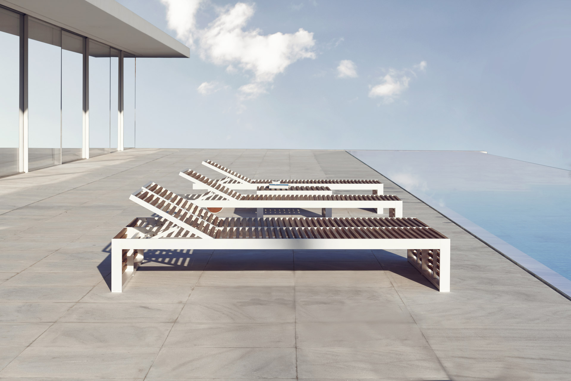
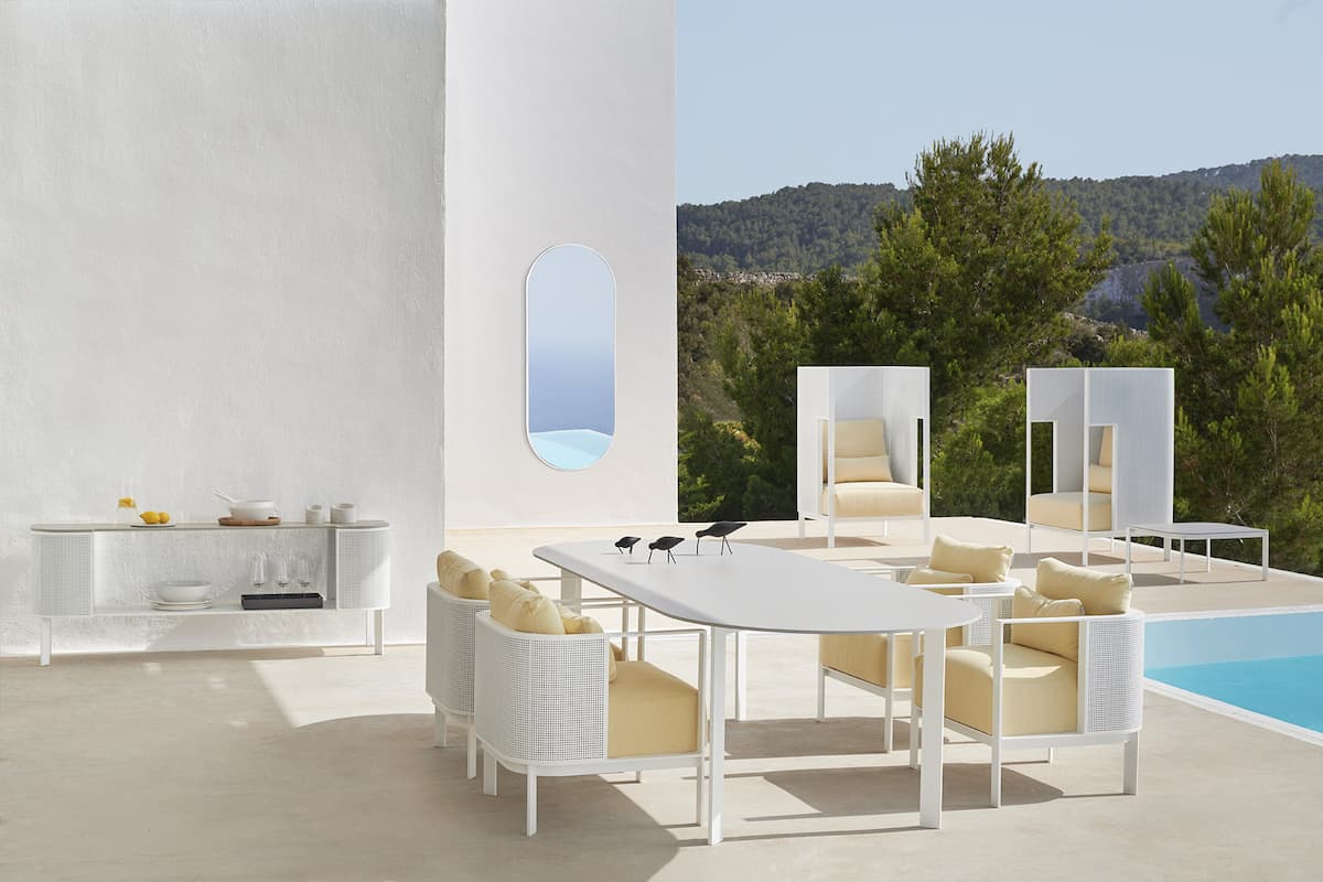
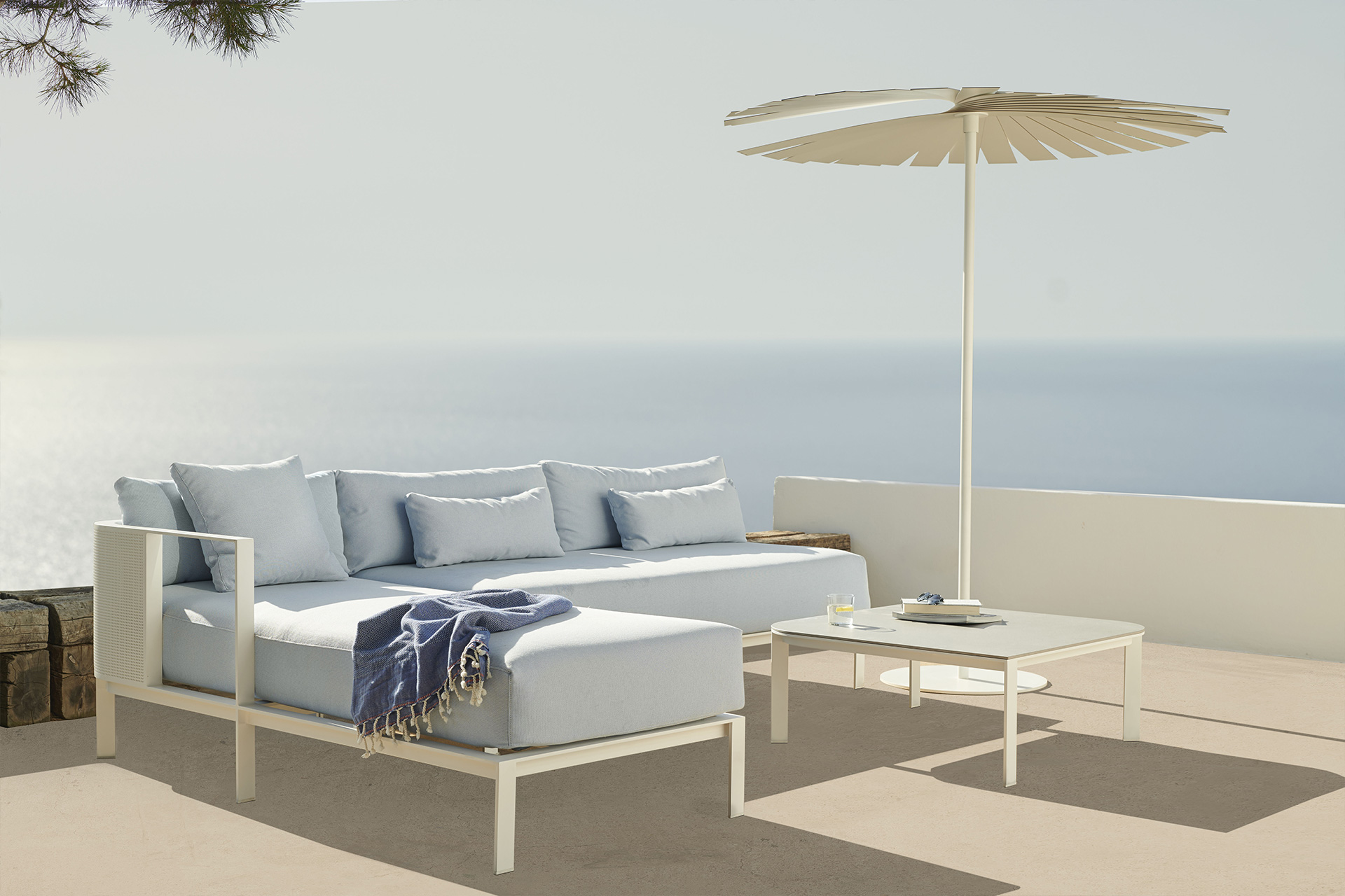
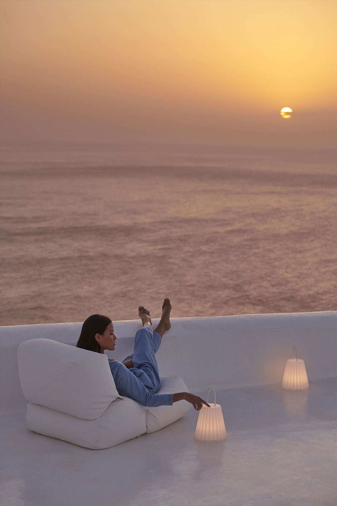
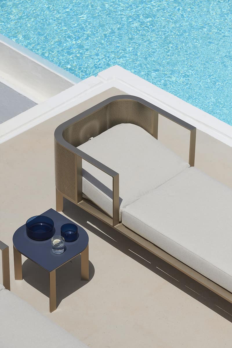
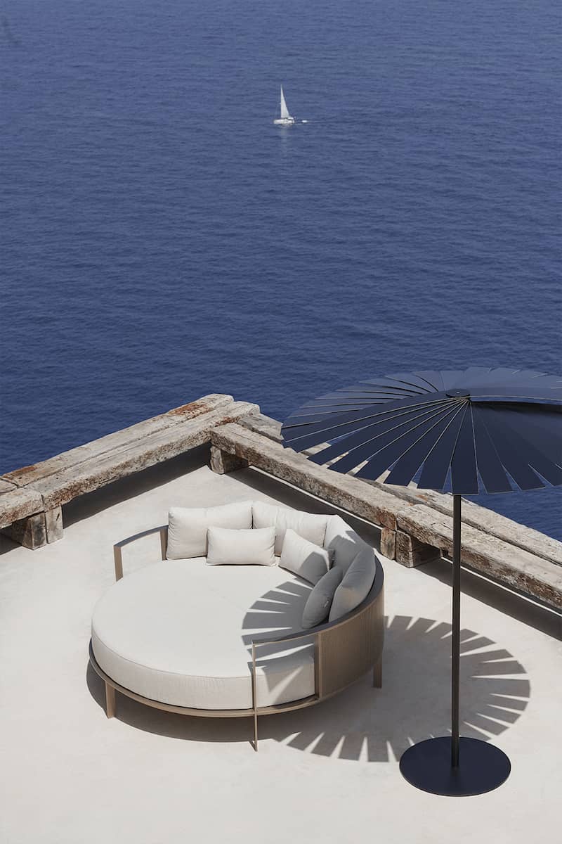
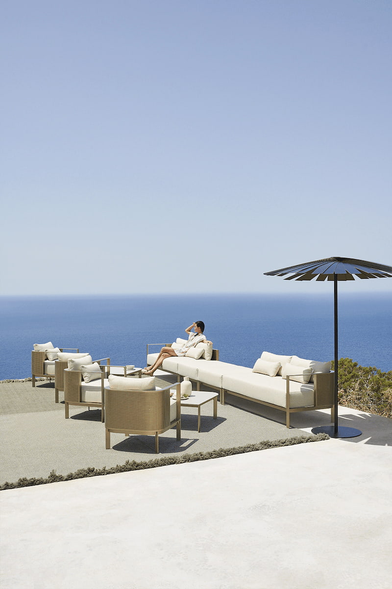
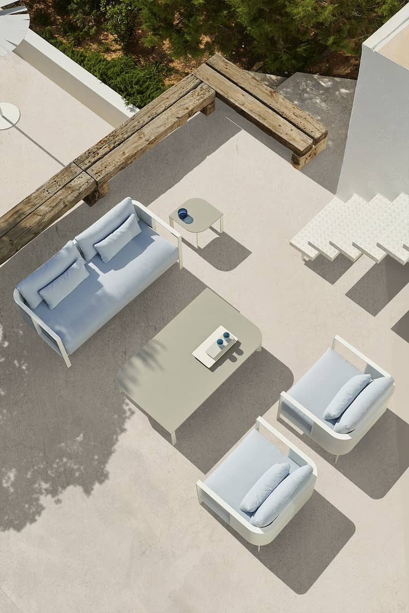
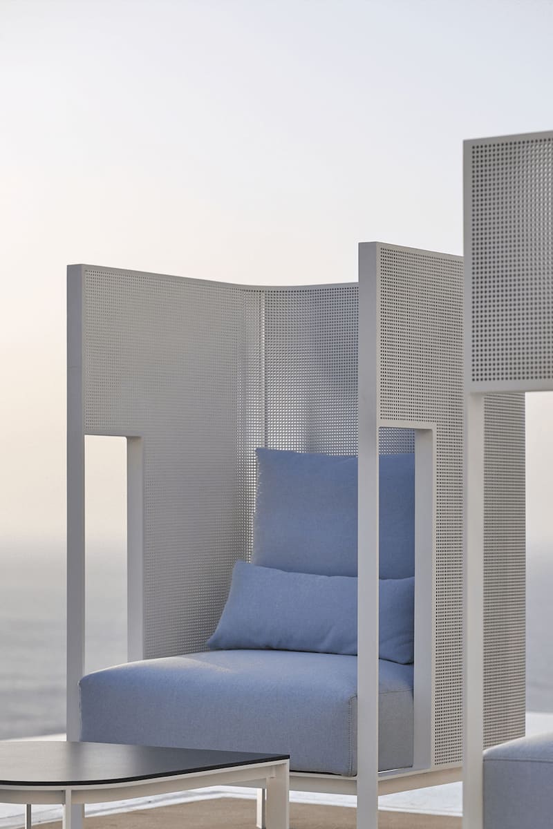
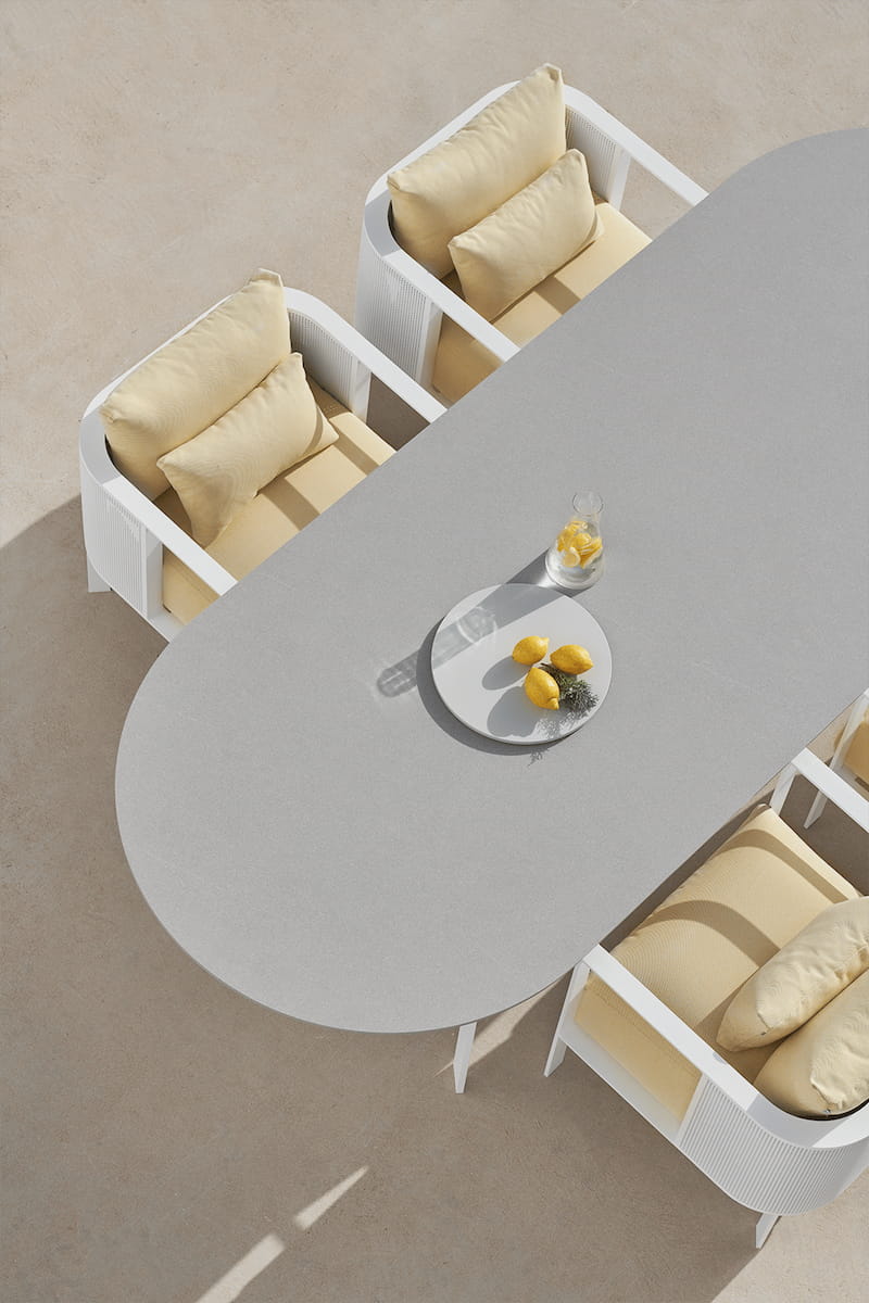
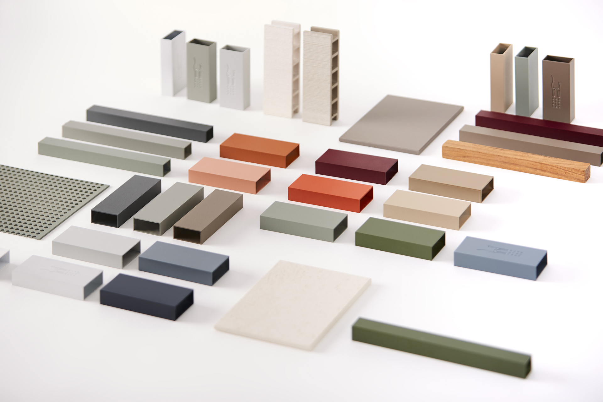
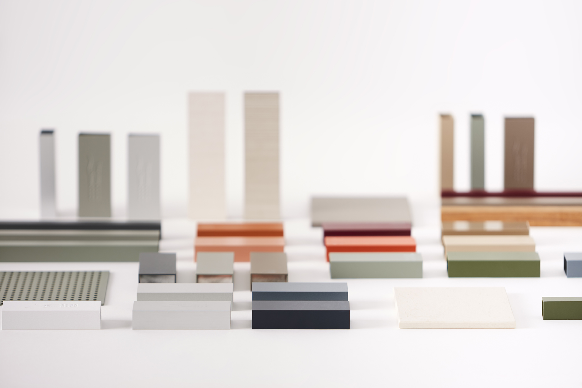
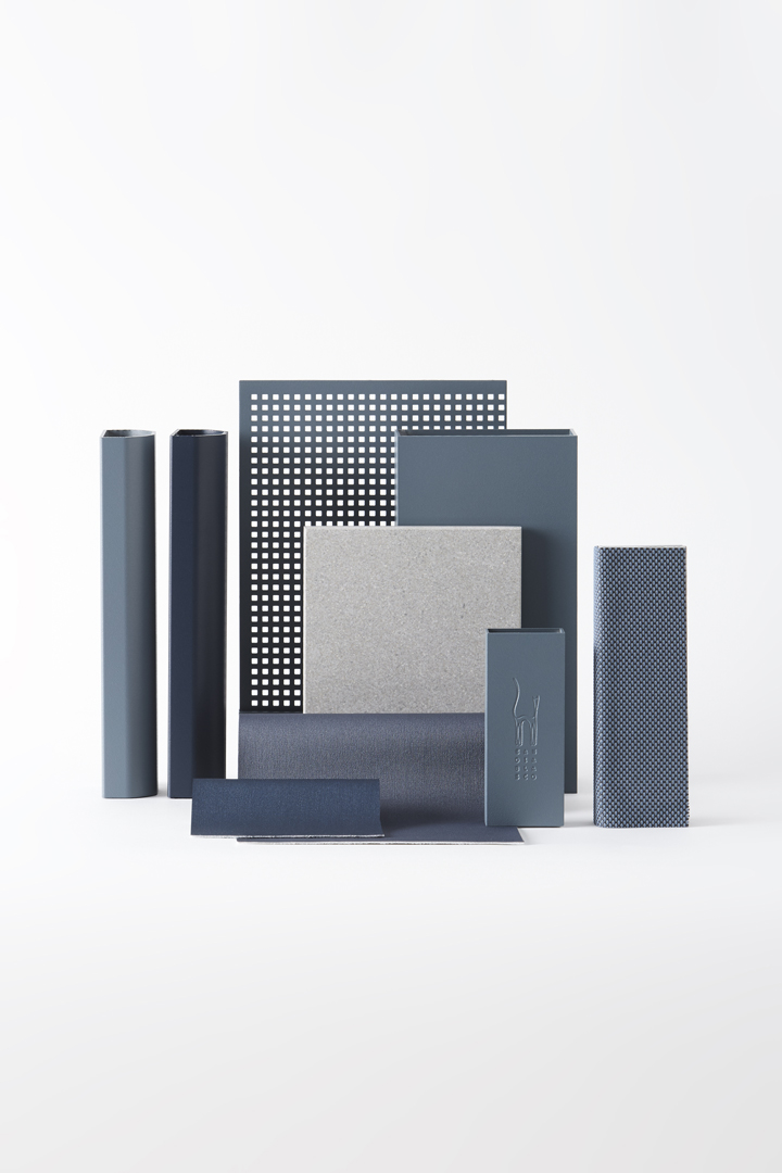
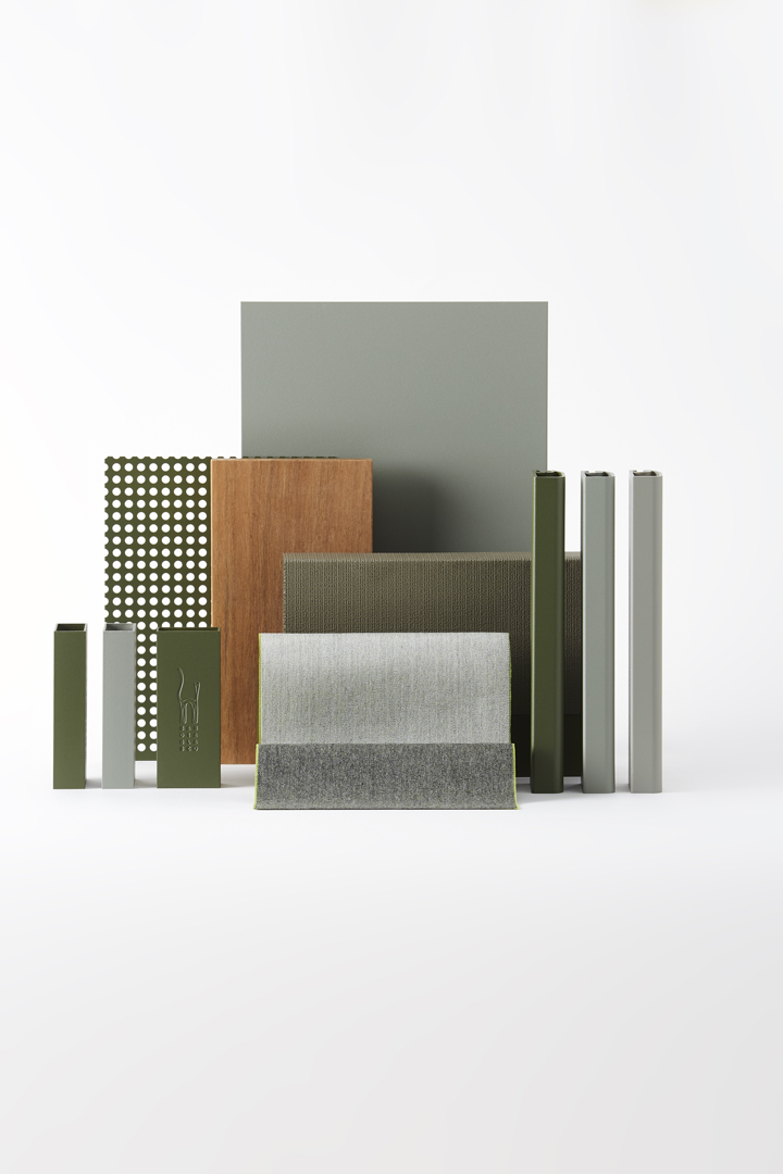
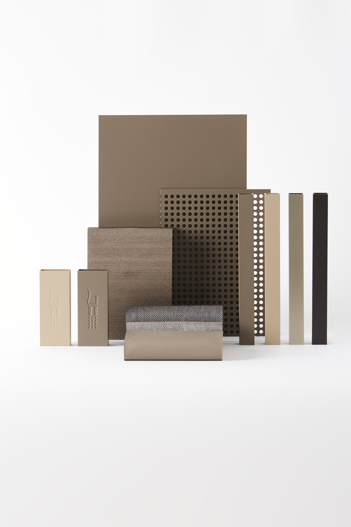
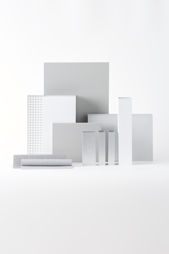
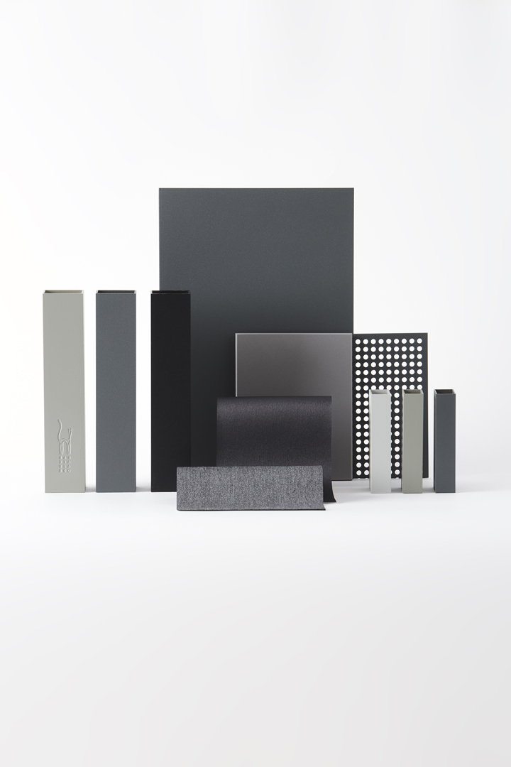
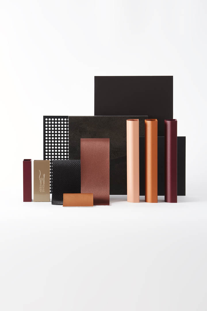
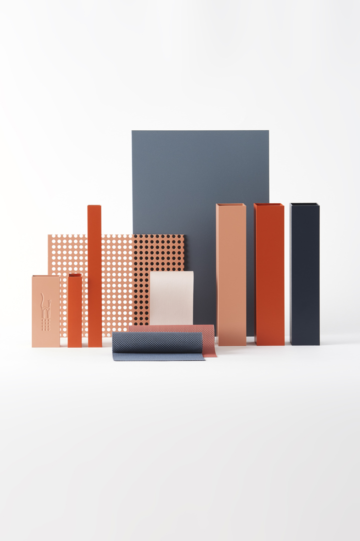
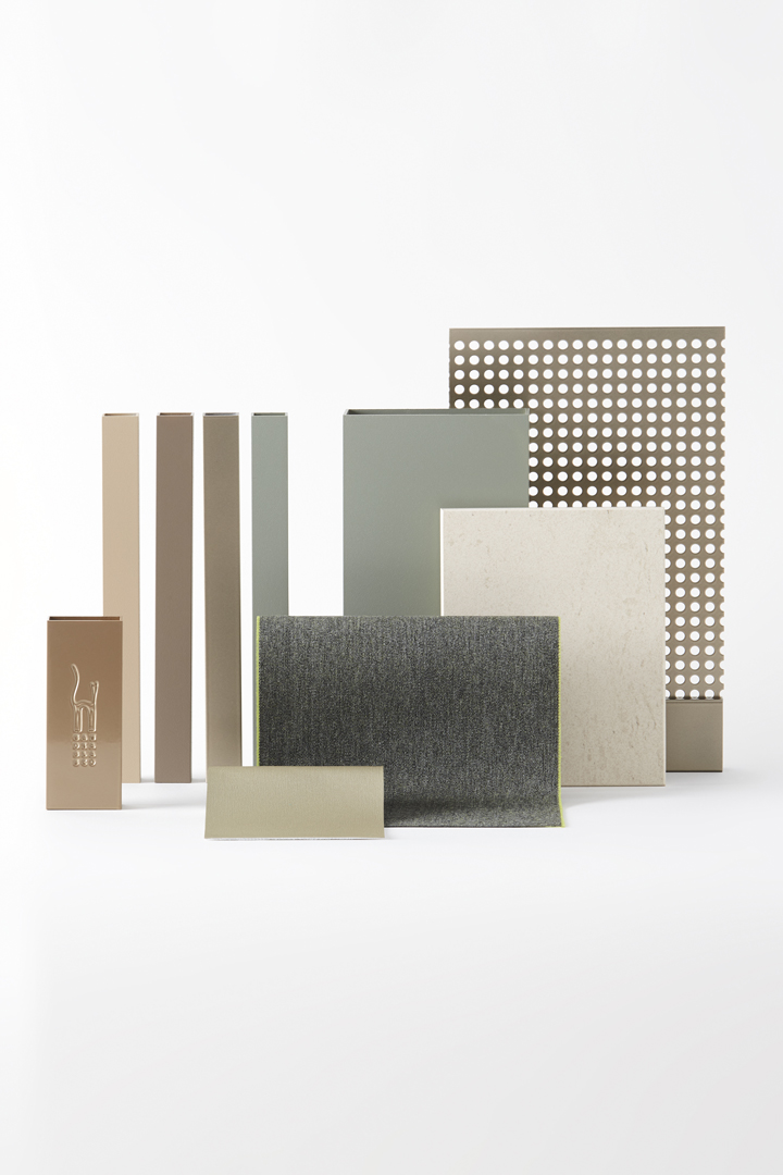
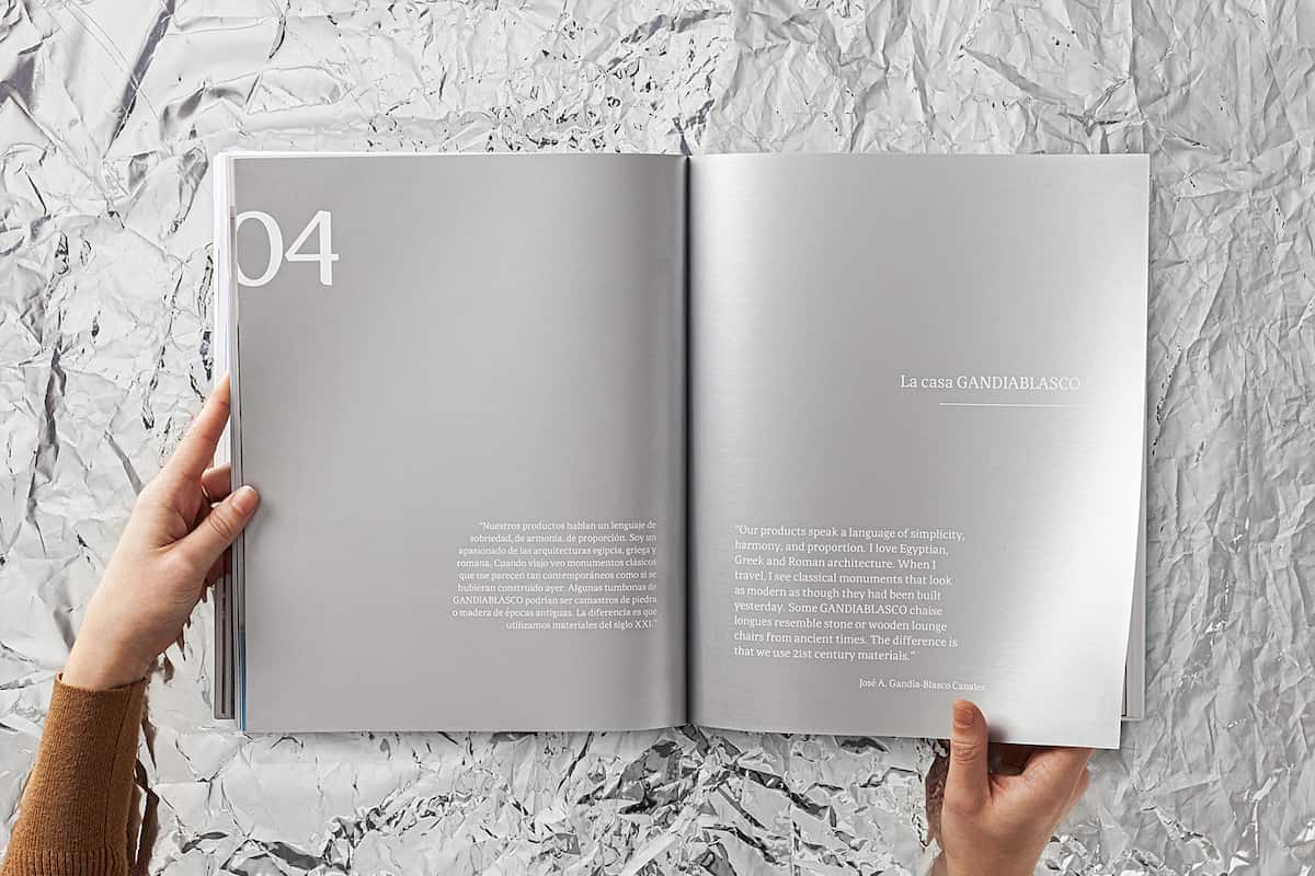
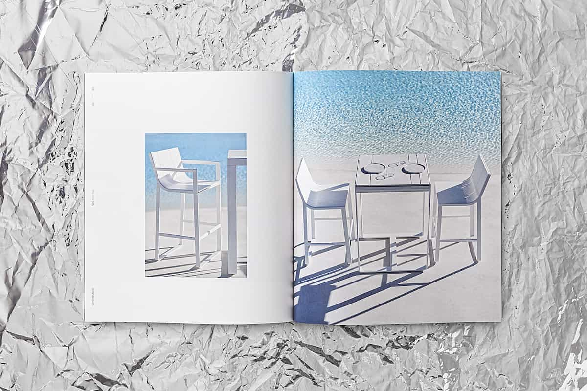
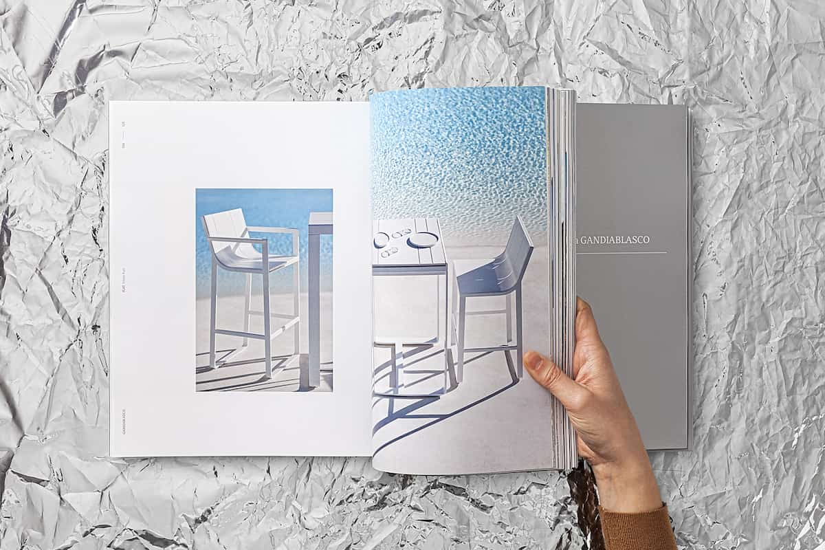
Gandiablasco is a brand of outdoor furniture strongly linked to Balearic vernacular architecture. The typical white color of the facades treated with lime, its ability to reflect the intense light of the Mediterranean, the blue of the skies… are essential visual elements of its personality. Now they are preparing to launch an expanded range of materials and color palette. At Odosdesign we work on the communication of the new range.

Design strategy

An essential question of the project is to talk about color, but without losing sight of what your personality traits are, where white has always been the clear protagonist. For this we worked on two parallel lines, but with a common language. On the one hand, the creation of still lifes to show the possibilities of color and material combinations. On the other, photographs for the products, framed within the Gandiablasco narrative universe. The union between the two is a clearly branded style, where color is introduced out of context and surrounded by white. Aluminum, Gandiablasco’s fetish material and present in all products, is the common thread that allows us to generate coherence between the different elements.

Art direction

For the art direction, we decided to make a different proposal to show products, through lifestyle photographs, and materials, which are displayed in still lifes.

The product photography explores the traditional elements of the brand: sea, Mediterranean spirit, intense blues of the sky and swimming pools, whites … are the elements that Gandiablasco breathes and make up the ideas of the visual proposal. With this strategy and brand in mind, we look for locations in Portugal and the Mediterranean coast that adapt in terms of landscape and architecture.

Atrezzo has been reduced to a minimum and custom decoration objects have been created in line with the color ranges of the designs, subtle introducing the brand’s new color palette.

The second part focuses on studio photographs to show the new range of colors. Still lifes are made combining materials and finishes. To escape the traditional ways of displaying finishes, we created a Gandiablasco metropolis. A kind of skyline that works as an architecture, a discipline closely linked to the brand. This also allows us to show the material with greater dimensionality and to play with the lights and shadows.

A part of this process consists of developing the color combination proposals, from single-color compositions, to the most sophisticated proposals within the range with gold or burgundy tones that explore new color codes for outdoor furniture.

Editorial design

Gandiablasco introduces new colors and finishes, but aluminum remains the essence of its product. In this way, the publication becomes a large block of aluminum that houses all its collections. We use it as a metaphor, with the silver edges and adding a book jacket like lacquer. Silver ink has also been the main ink inside the catalog.

Gandiablasco has flexible products, so each collection has different variants. To simplify this complexity without losing information, we devised a series of graphic representations of the possible configurations of each collection.