Designing an identity that puts nature at the center
Citysens Lab was born with a clear conviction: spaces can take care of people. Their approach, grounded in biophilia, aims to transform offices, hospitals, and other contract environments into places that bring calm, beauty, and well-being through the active presence of nature.
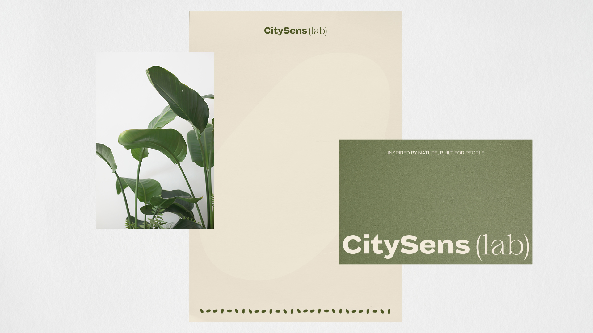
We embraced the challenge of creating a visual identity capable of conveying this philosophy in a contemporary, elegant, and organic way.
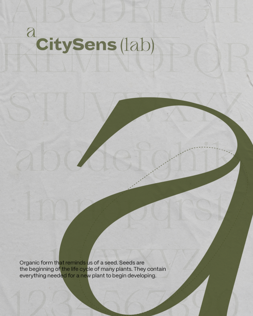
Concept: the seed as the origin of everything
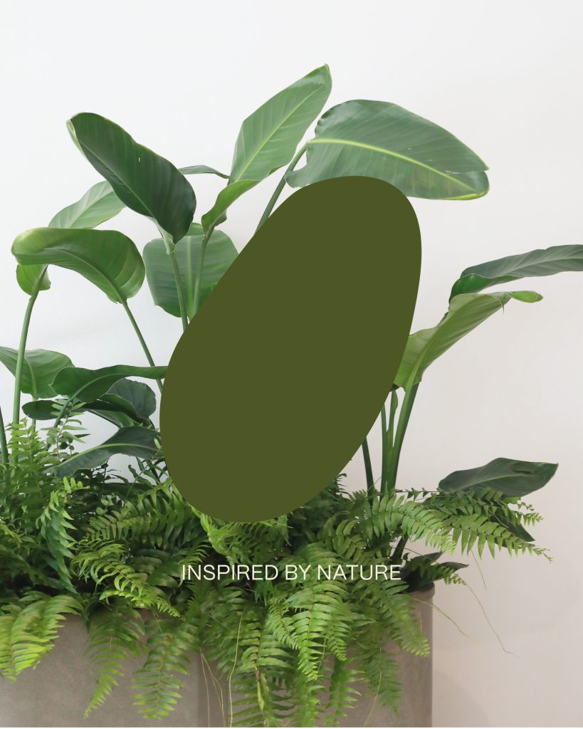
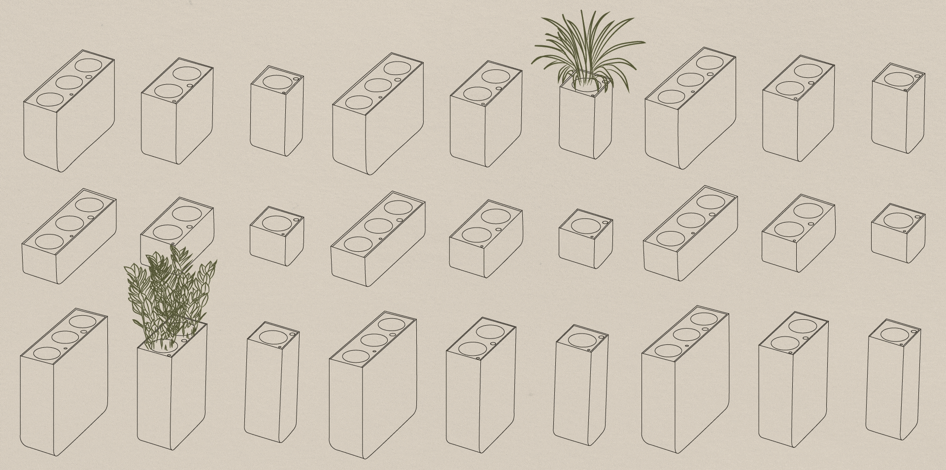
The brand’s starting point is an organic shape inspired by a seed, which becomes the main icon of Citysens Lab.
The seed represents the beginning of the life cycle, the potential for growth, and the transformative power inherent in nature. It’s a direct metaphor for the brand’s purpose: to spark new beginnings within spaces.
This fluid, adaptable form becomes the backbone of a dynamic graphic system that evolves just as nature does.
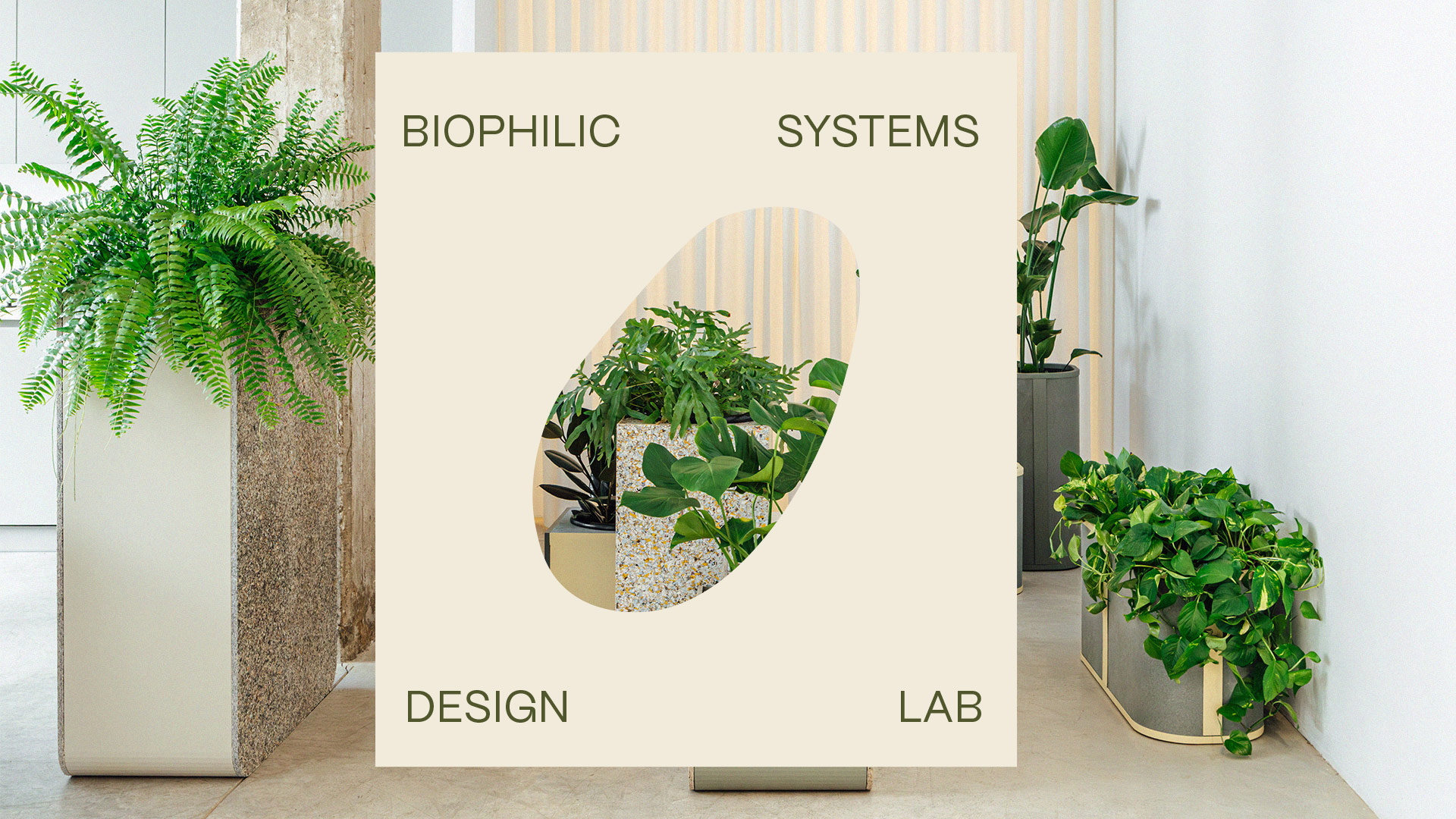
The Citysens Lab identity works as a reflection of its mission: creating more human-centered environments through biophilia. It’s a visual language that not only supports their proposal, but amplifies it and makes it instantly recognizable—conveying a sense of well-being that connects directly with their core values.
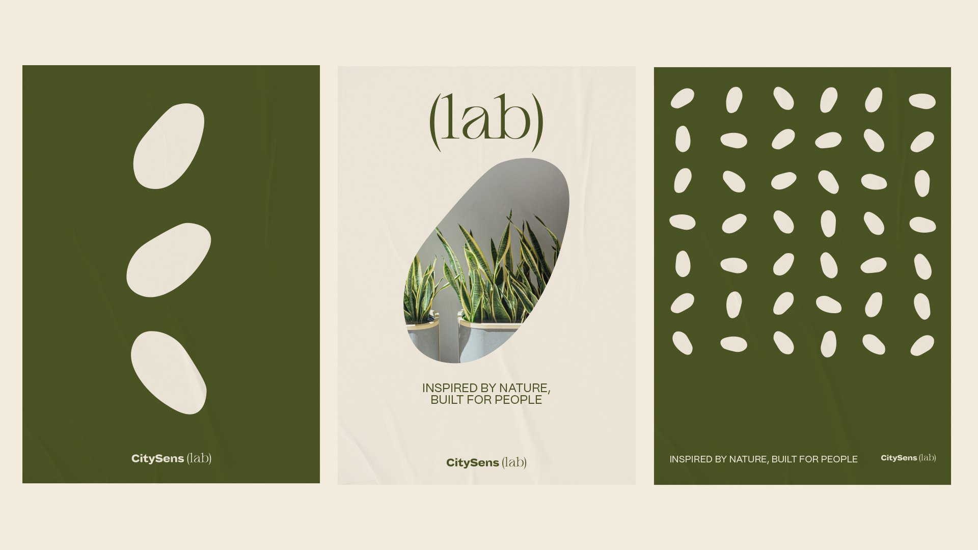
A dynamic and living visual language
To bring coherence and richness to the brand universe, we developed a system that combines several key elements:
The seed, as a central and flexible symbol.
The parenthesis, used as a graphic device that encloses, protects, and defines—just like a space designed to care for people.
Botanical illustrations, which add visual sensitivity and reinforce the direct connection with the plant world.
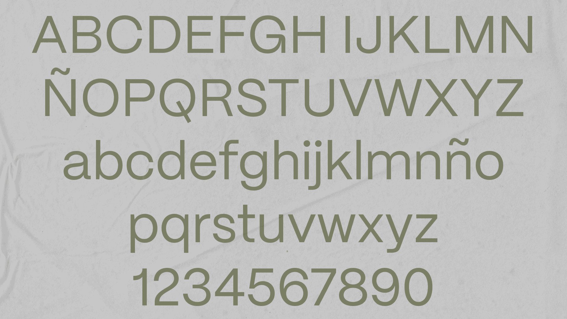
The identity is completed with a carefully selected color palette, based on natural, nuanced tones that evoke serenity and well-being. These colors act as an extension of the biophilic concept itself: conveying calm, trust, and harmony across any brand application.
The result is an identity that breathes naturalness, movement, and balance—one that can easily adapt to a wide range of formats and uses.
A digital environment that amplifies the experience
In addition to the branding, we also designed the Citysens Lab website, conceived as a natural extension of the identity. It’s a visually light, fluid, and organic platform, where the narrative unfolds through gentle animations, intentional use of white space, and a navigation style that prioritizes calm and clarity.
The result is a digital environment fully aligned with the brand—one that guides the user and conveys the biophilic essence of Citysens Lab.