Danao is a United States outdoor furniture company highly oriented to the American market and with a long history of collaborations with leading European designers. Right now they are looking for a more global language that allows them to stand out in the US market. That is why they asked us to redesign and reposition their brand capable of expressing the company’s values present in the product but not so clearly in communication: a high-value design with a clear inspiration in contemporary internationalist architecture and a spirit rooted in the American Landscape. At Odosdesign we made a journey of discovery of the American nature, to connect the brand with the territory.
Design & brand strategy
From the point of view of identity, our goal was to translate a series of intangible issues, such as the feeling of calm and excitation by the overwhelming nature, into a brand. We had to consider more elements. Danao is characterized by a contemporary design, elegant luxury, which breathes peace and tranquility.
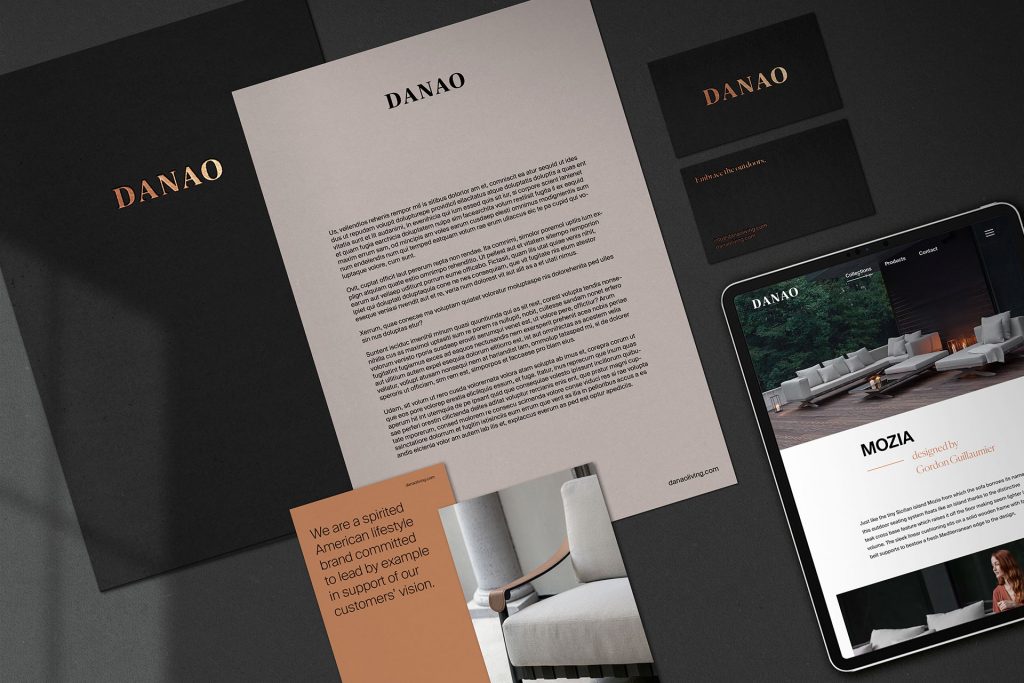
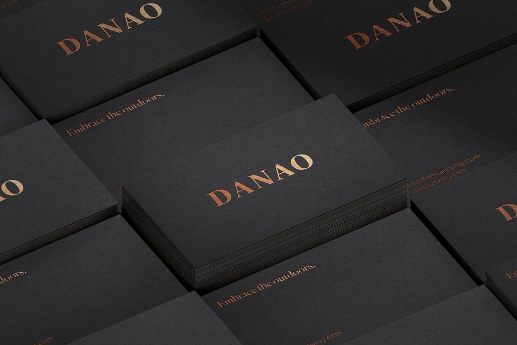
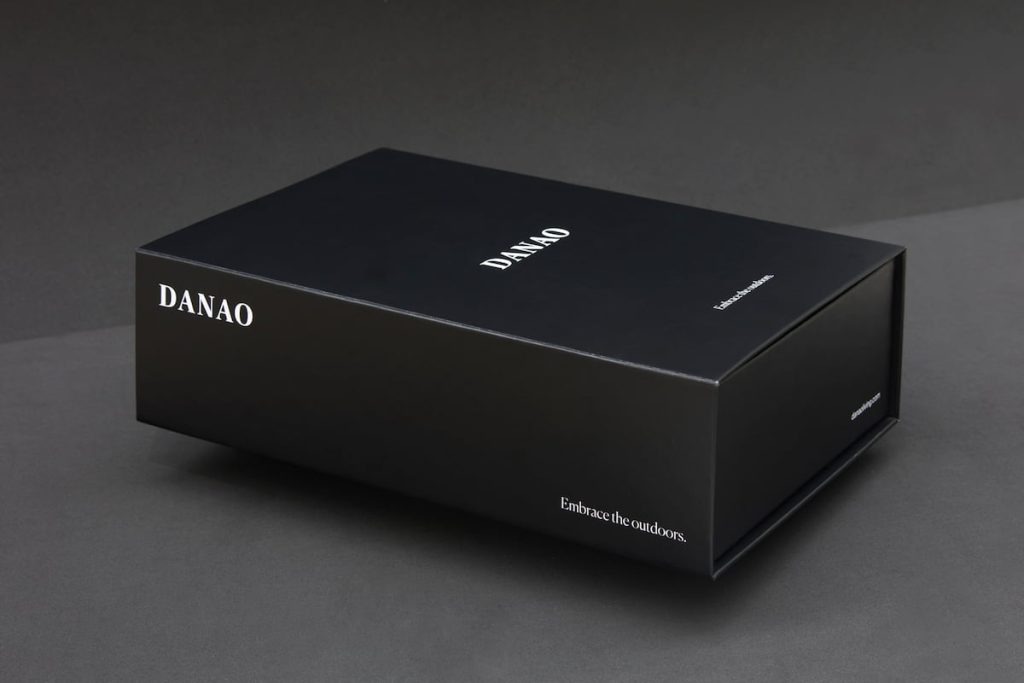
In the creation of the brand, we decided to capture these values through a timeless but very present logo. We chose a strong typeface, but at the same time neutral and resistant to the passage of time. A brand that moves away from the typical narratives of the habitat sector, to approach a language and codes closer to the world of fashion, another of the company’s inspiring territories.
We combined two fonts to enrich the identity. We worked with a geometric family like Suisse International, a font that belongs to an extensive family created by Swiss Typefaces. The font has the timelessness, consistency and readability necessary for a contemporary brand. We combined it with the Canela serif typeface, very stylized and elegant to generate outstanding elements in the editorial line.
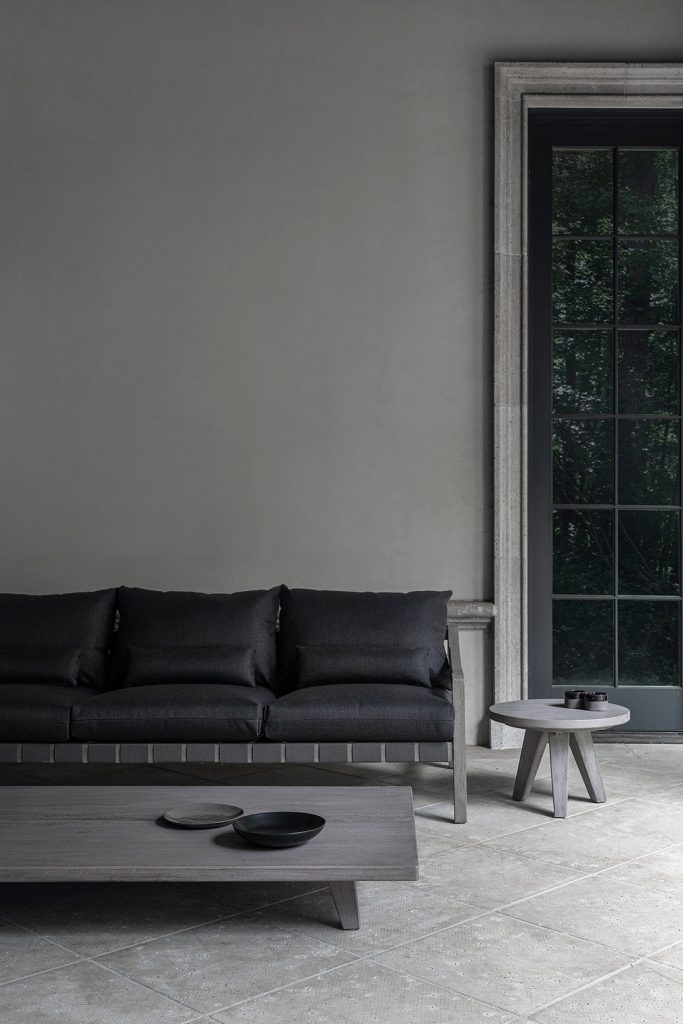
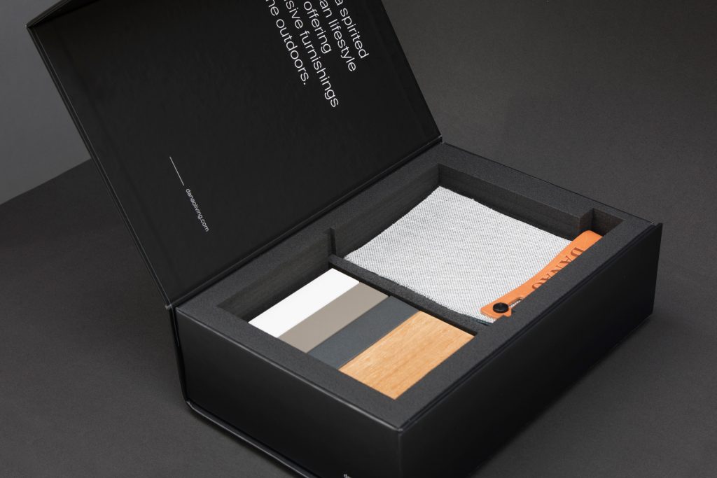
The landscape is an essential part to understand Danao and must be a clear protagonist through Art Direction and Photography. We chose black and white with the logo in neutral for the colors of the brand. The main color is copper, extracted from the earthy tones of landscapes such as the Grand Canyon and the sub-desert climate of states such as Arizona or Utah, and also from the colors of sunset projeted onto the landscape.
Art Direction
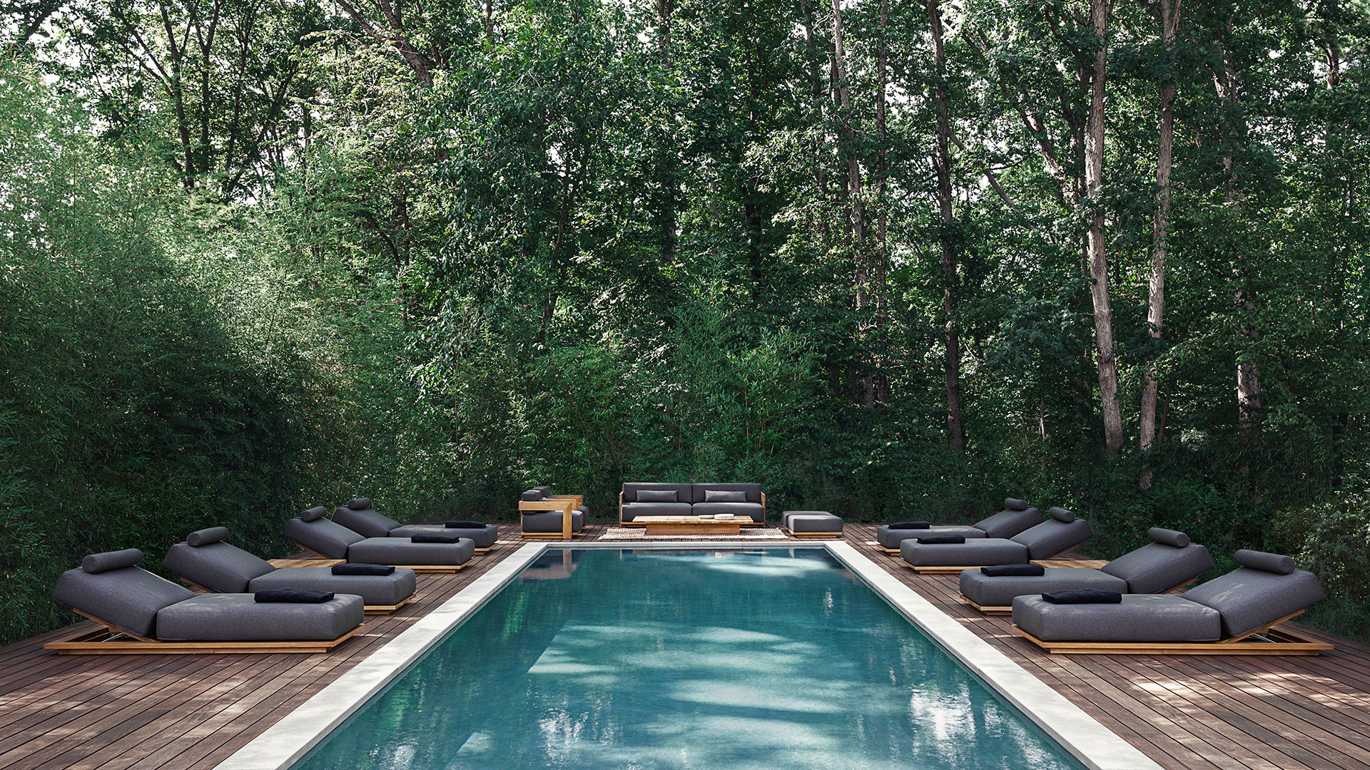
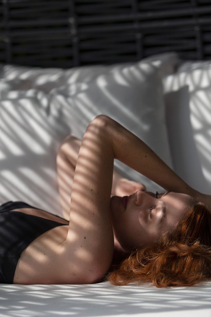
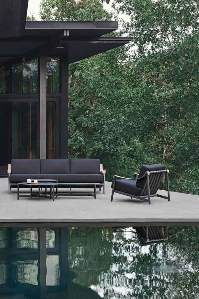
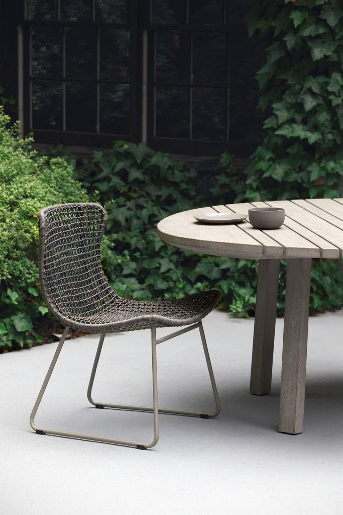
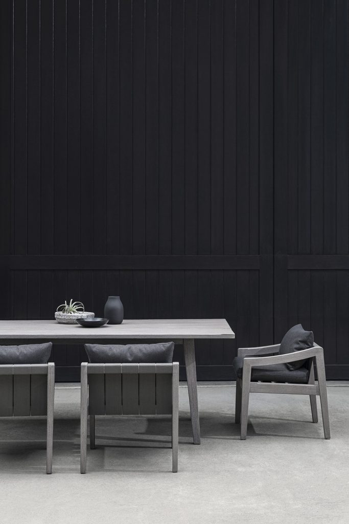
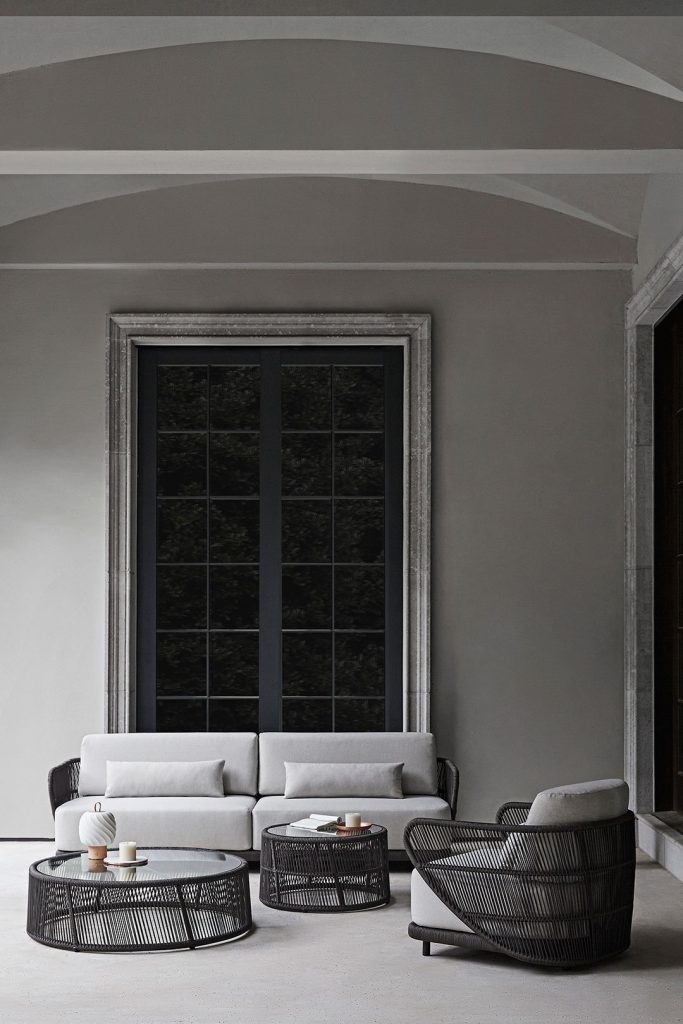
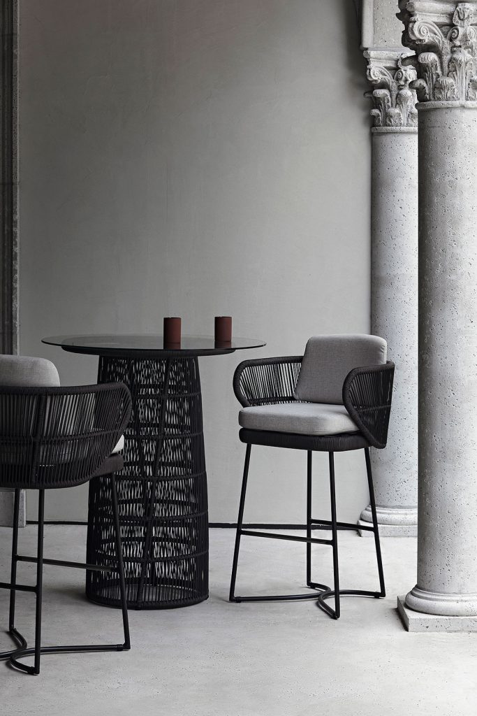
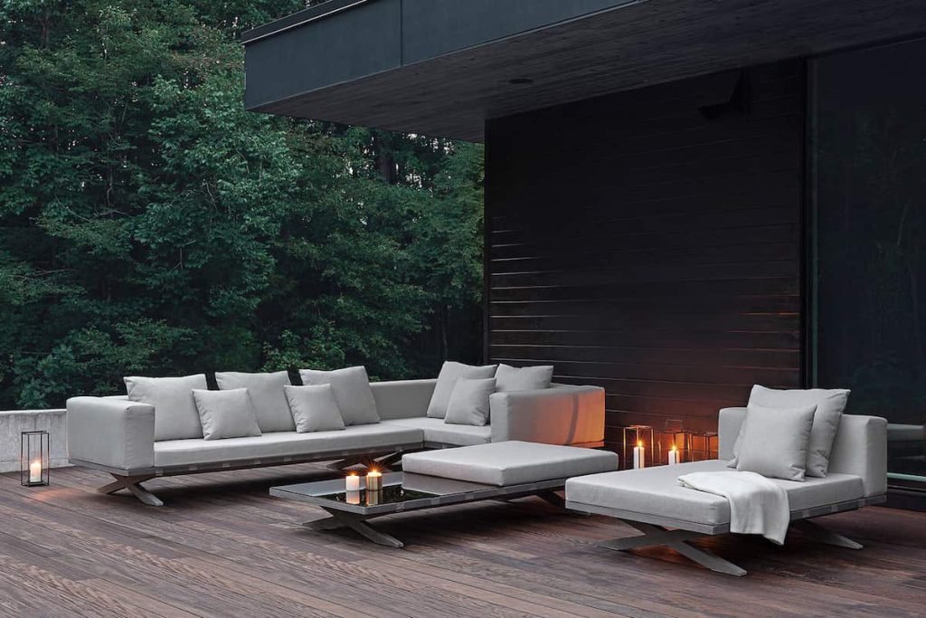
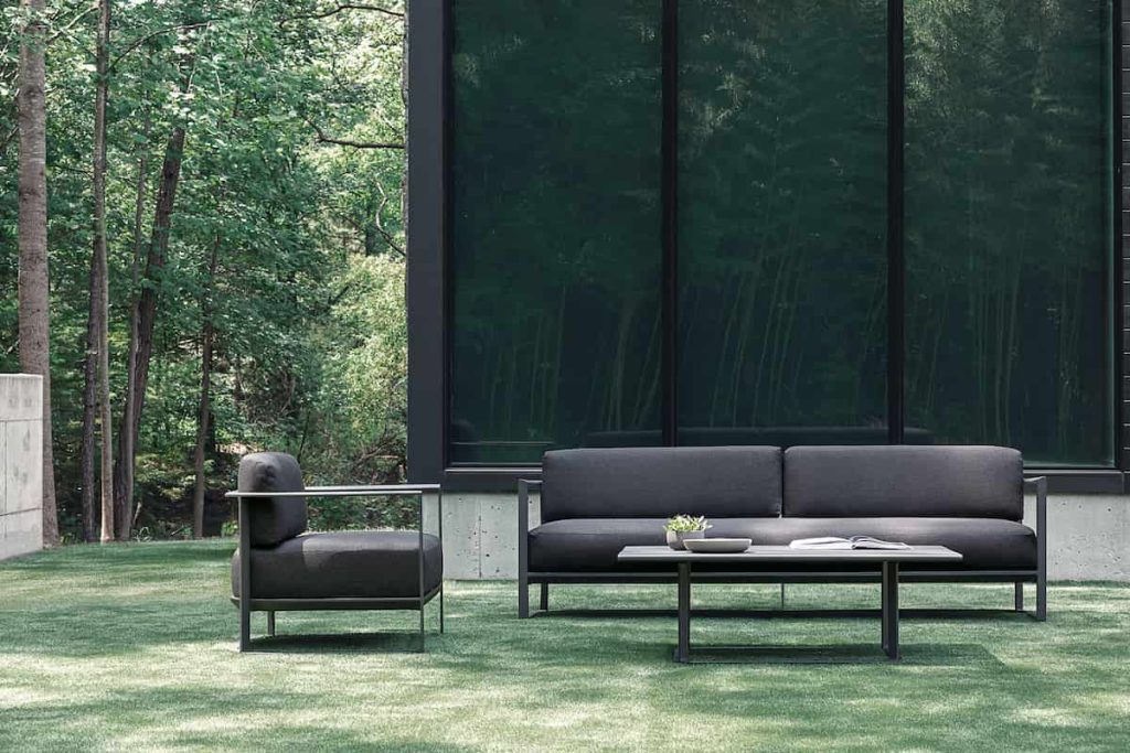
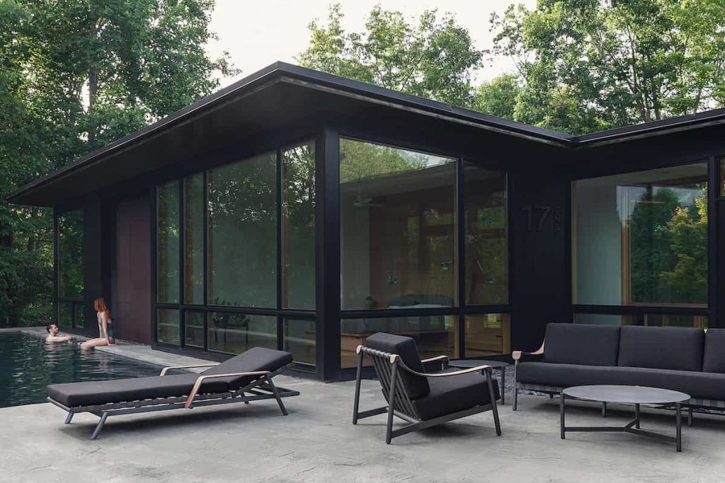
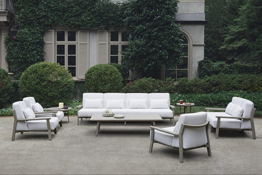
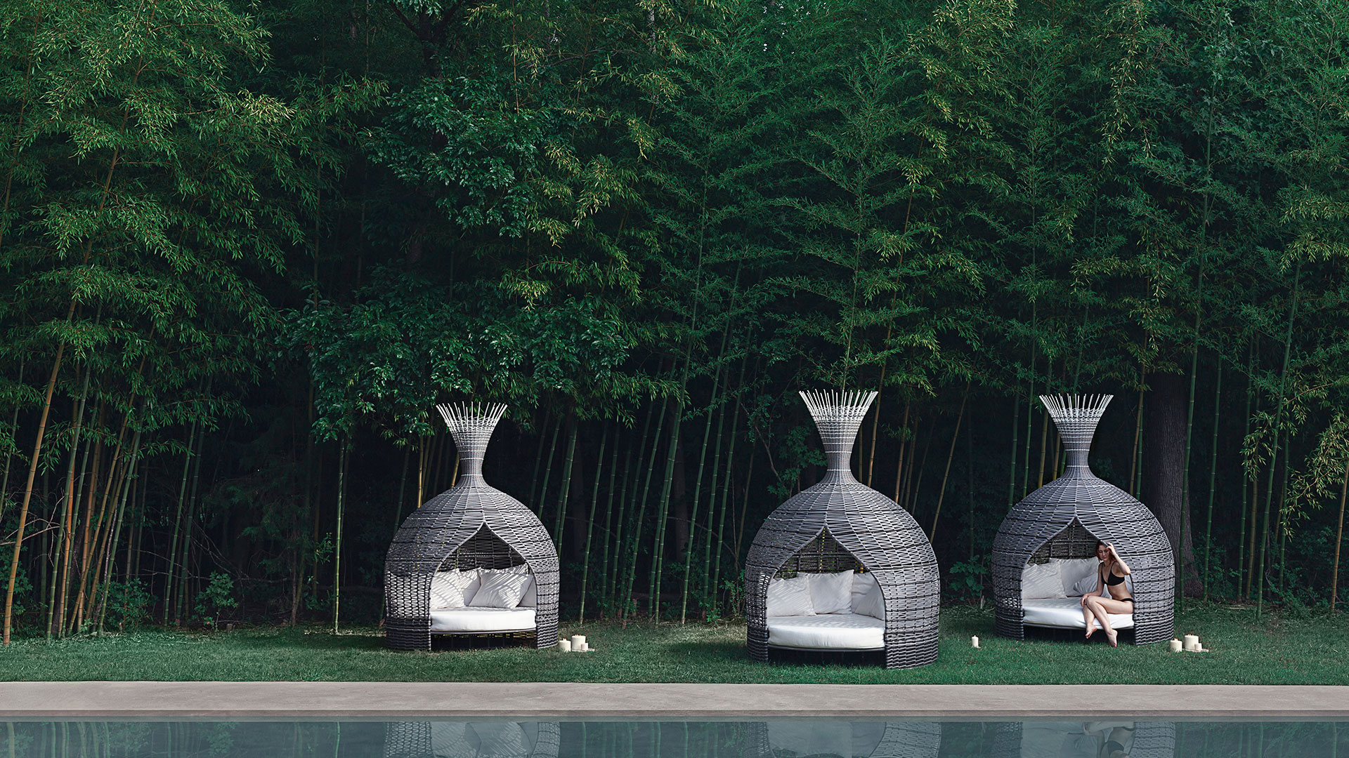
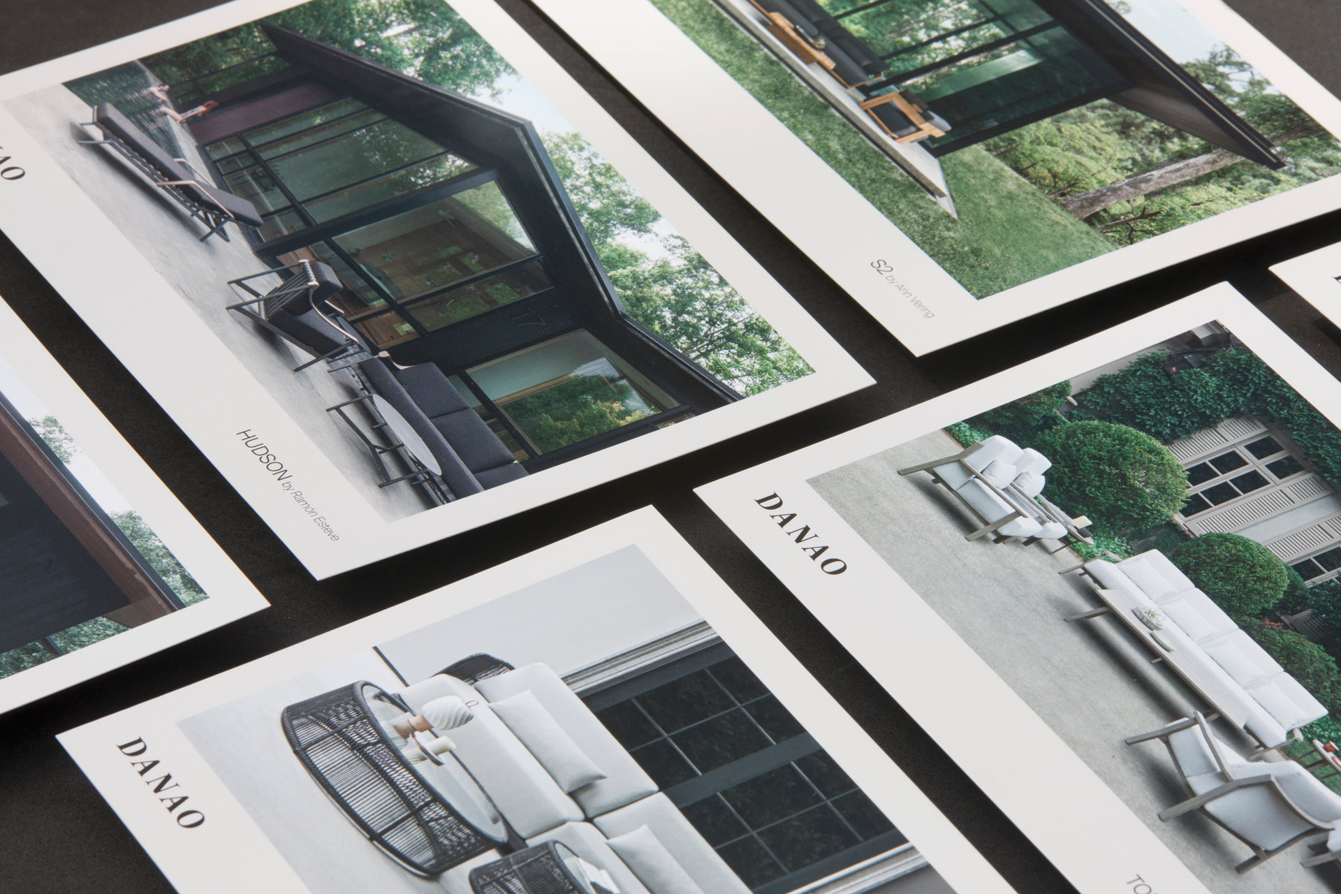
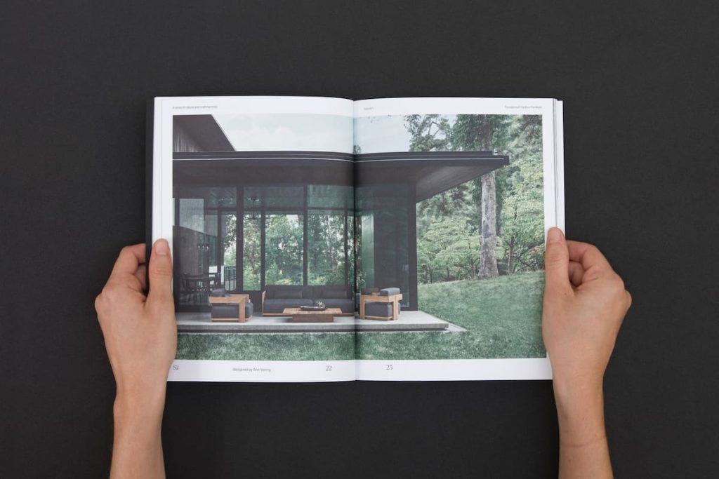
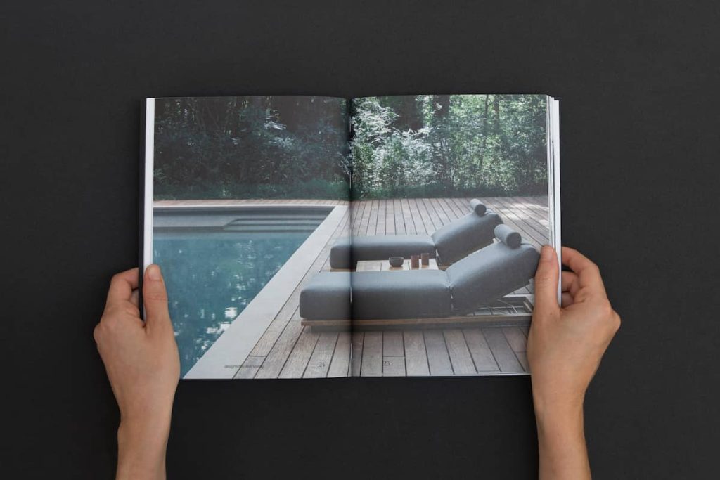
We did a photo shoot in different locations in the USA that combined contemporary reference architecture with natural environments. The objective has always been to connect the interior space of the house with the outdoors, blurring the limits between the house and the garden or the terraces, generating an aspect of natural refuge. To do this, we created a visual imagery that connects open outdoor spaces with a rugged and wild vegetation and landscape, a nature that is enjoyed at any time of the year, regardless of the season.
The chosen locations stand out for the presence of an intense green, of forests and trees, combined with architectures with noble materials and deep tones. Dark-toned woods, slate, and dark tiles abound, as well as metal beams. These are spaces with a lot of personality but neutral enough to highlight the materials of Danao’s designs.
Attrezzo has been reduced to a minimum and natural shadow projections have been used as a way of integrating each piece more immediately into nature. The final set breathes the company’s design lines: elegance, peace and privacy.
Editorial Design
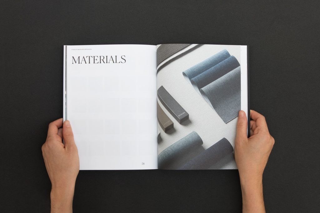
We have made an editorial line approach for the product brochure. It is a catalog that explores the two lines of business of Danao -residential and hospitality- and where it is especially important to transmit the values of the brand.
In the editorial line we take the fashion world as a reference, to highlight the image over the rest of the elements. We have opted for a sober graphic design with little decoration, where the headlines and large-format typefaces allow us to continue building the brand, giving prominence to product photography.
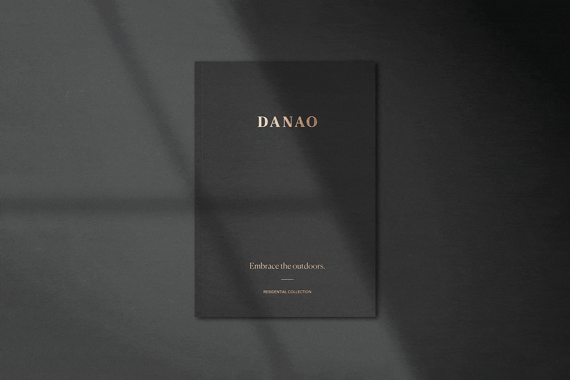
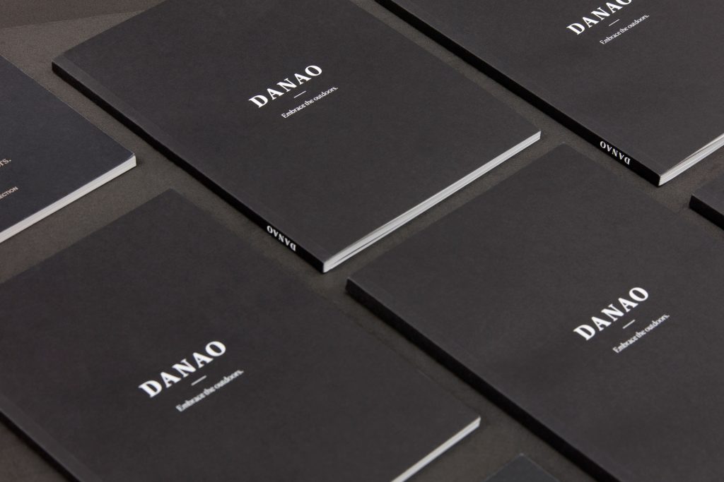
A dark paper has been used for the cover, selected for its tactile properties and texturing, which help us to transmit the brand’s contact with nature. The interior layout has been treated as a photobook, prioritizing the importance of the image with respect to the text or technical content. The goal is to be able to convey elegance and forceful presence of each of the designs, eliminating anything that diverts attention.
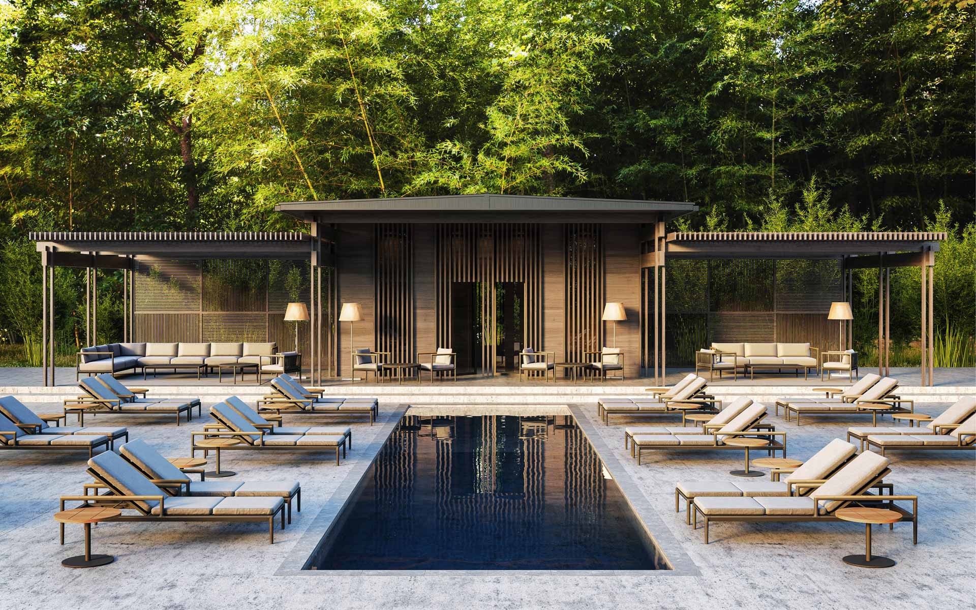
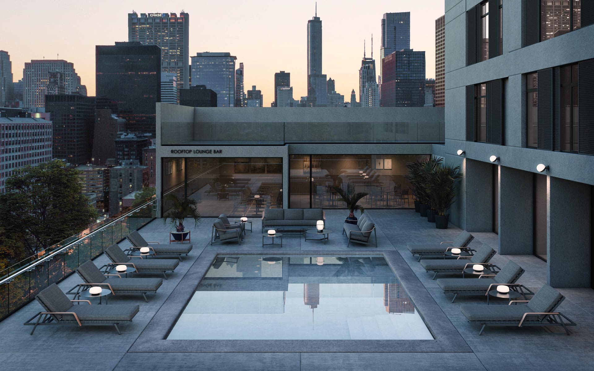
3D Images
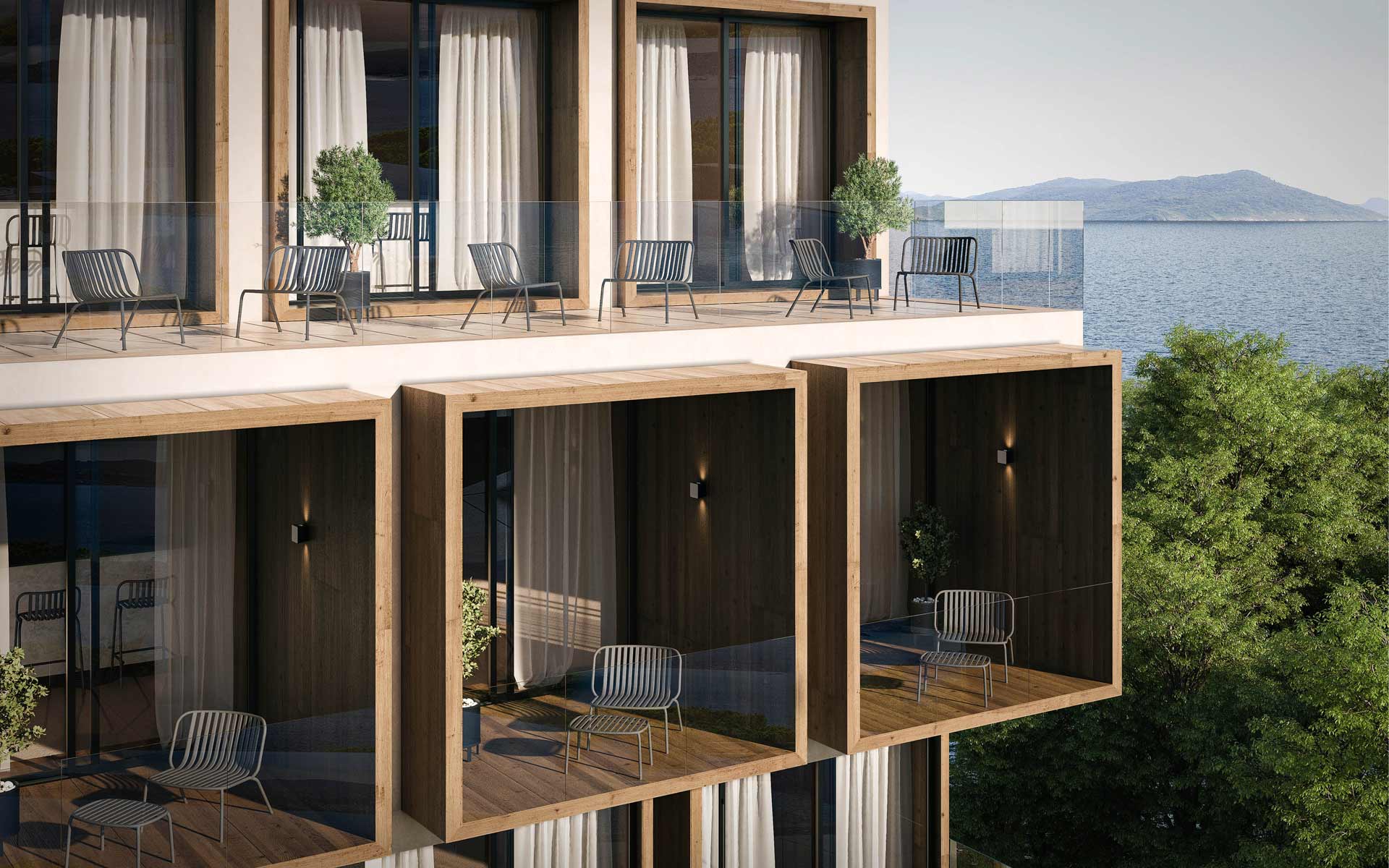
Photo shootings are completed with CG renderings, placing the product in contract environments. An essential issue has been to recreate realistic spaces that speak the same architectural language as the brand. Transferring the brand’s values to physical spaces and introducing the different designs in new contexts: hotels, restaurants, offices…
Digital
We have taken the brand to the different digital media and we have given coherence to the entire brand through its projection channels.
The web has been a rationalisation exercise to achieve a clear and minimalist appearance. Our purpose is that, once again, the images and small video pieces were the central elements of the page. The main colors are black and white, with a very subtle presence of the earthy tone, which has been reserved for secondary and tertiary headings, a way to translate the editorial design strategy to online support.
Once again in digital media, the visual impact falls on photography, the main asset that clearly reflects the brand’s values: nature, contemporary and author’s design.
This website uses cookies to improve your experience. We'll assume you're ok with this, but you can opt-out if you wish.AcceptRead More