The creative direction process that we have carried out over the last few years for Vertisol has been based on monitoring and advice to boost the company’s trajectory; the result of this exercise is the new narrative and the new VertisolRugs collections. This new line of rugs is the result of continuous monitoring, identifying and analysing gaps in the market in order to strengthen the company’s positioning. After defining the storytelling and the technical aspects of the Rugs collections, we put the finishing touches on the art direction and the editorial project that presents the latest novelties.
Art Direction
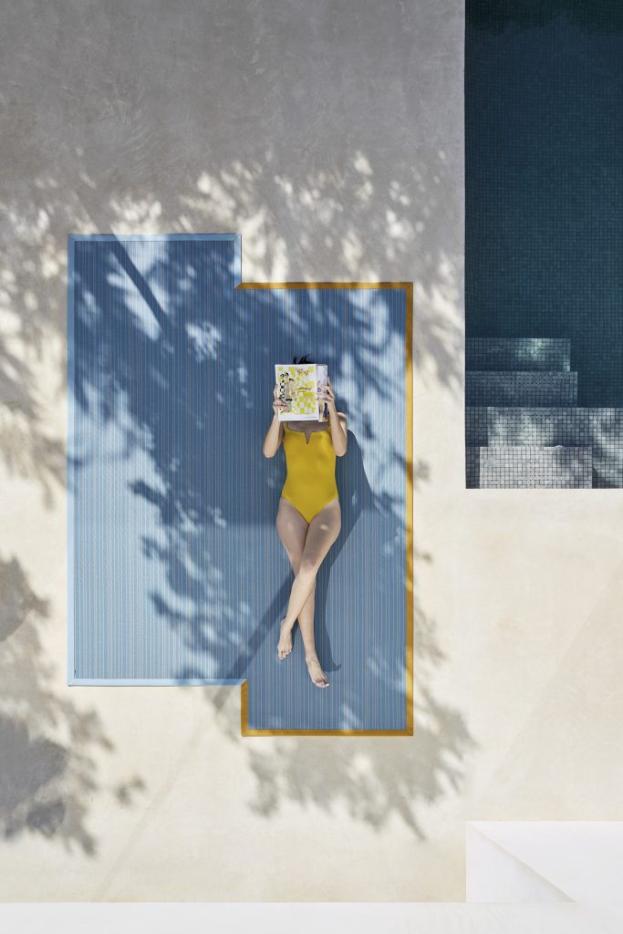
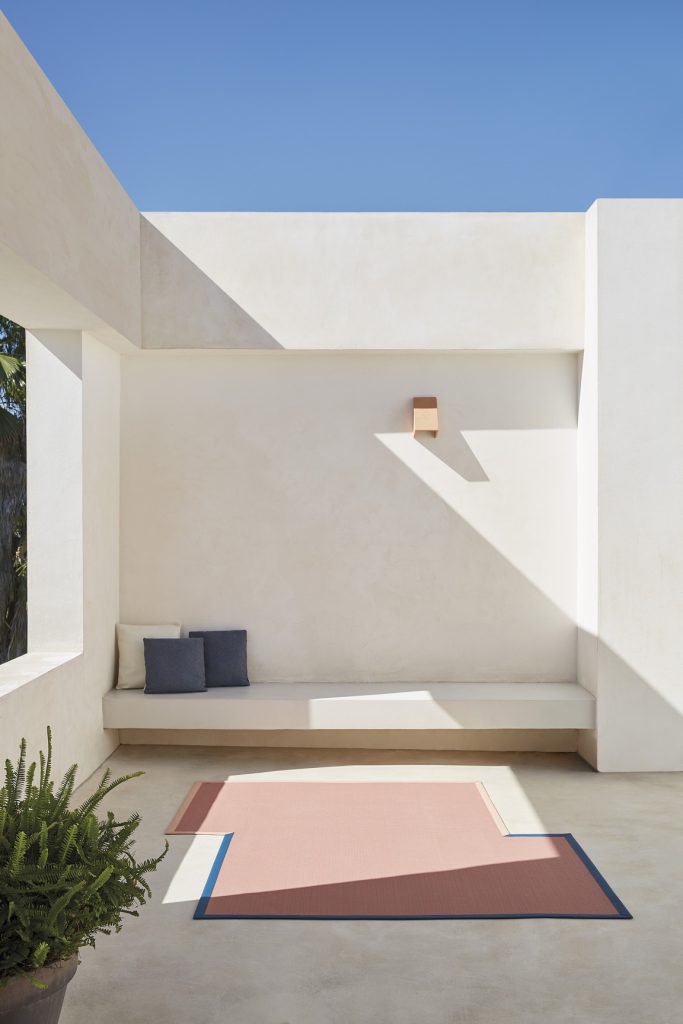
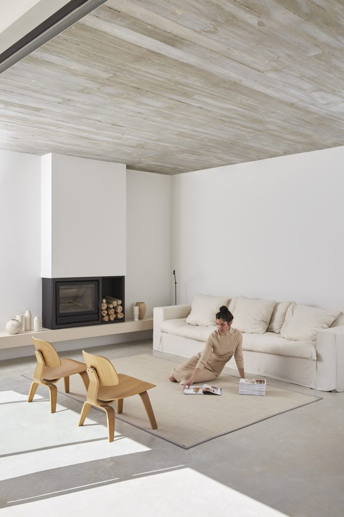
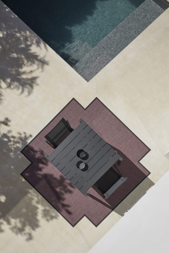
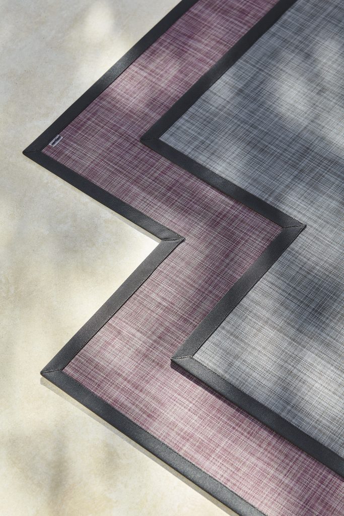
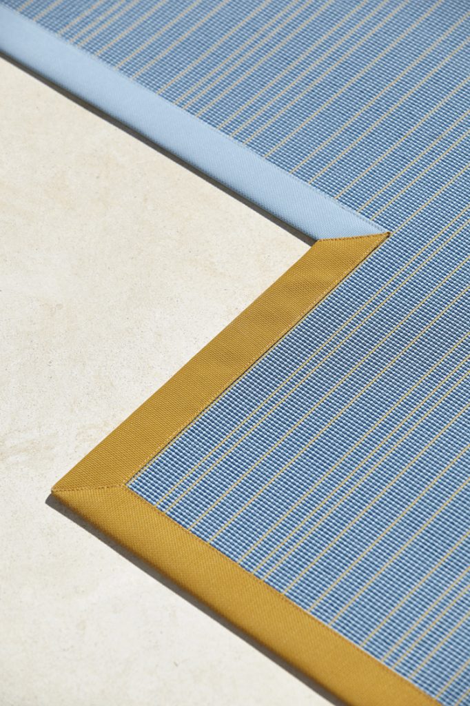
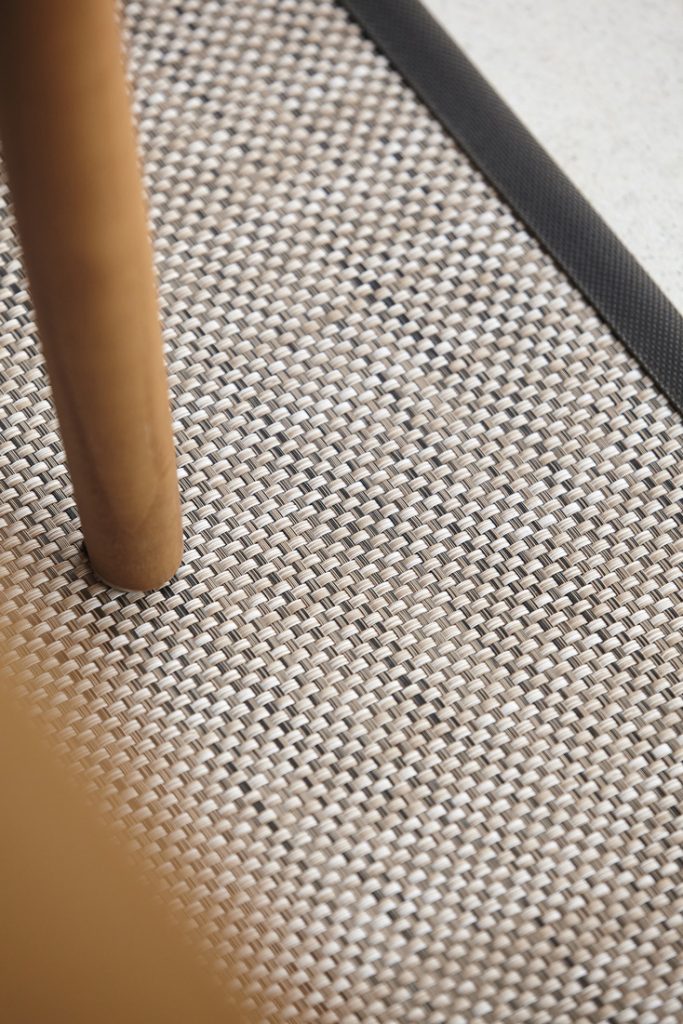
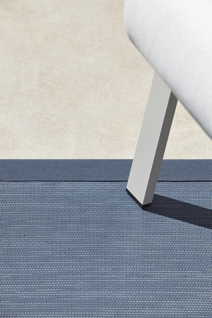
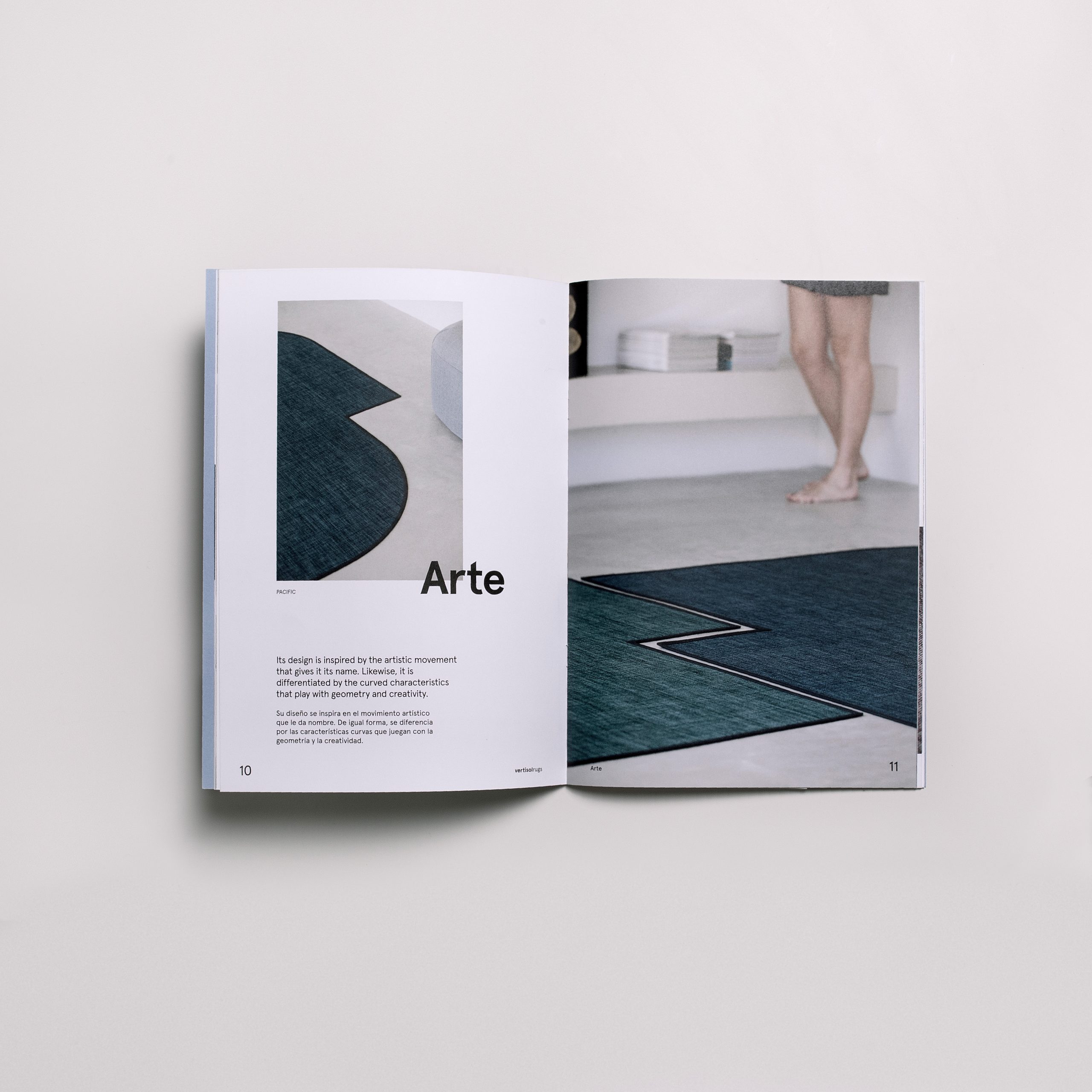
In the art direction we have focused on creating images that highlight the chromatic ranges and the different textures, shapes and finishes of the carpets.
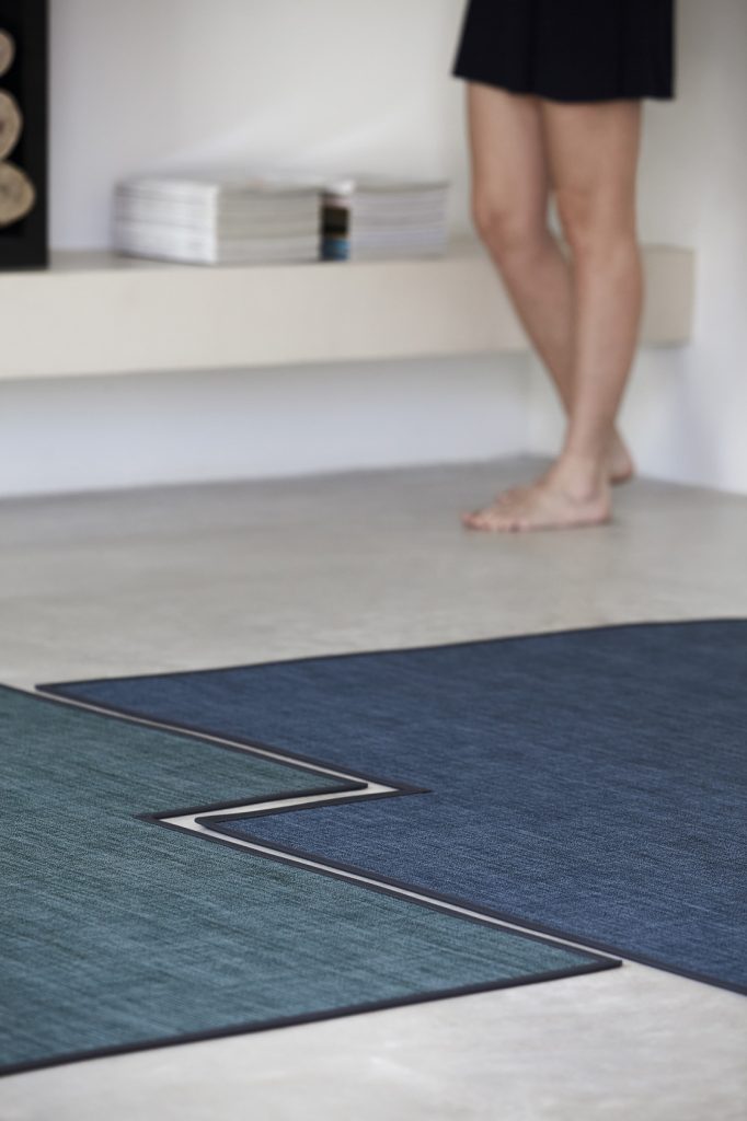
We selected a location with a neutral and timeless style, in which the interior and exterior spaces have the same language, and allow us to appreciate the versatility of the technical fabric and the final effect of the product in an inhabited space. Hence the compositions with the model representing everyday and natural actions of everyday life.
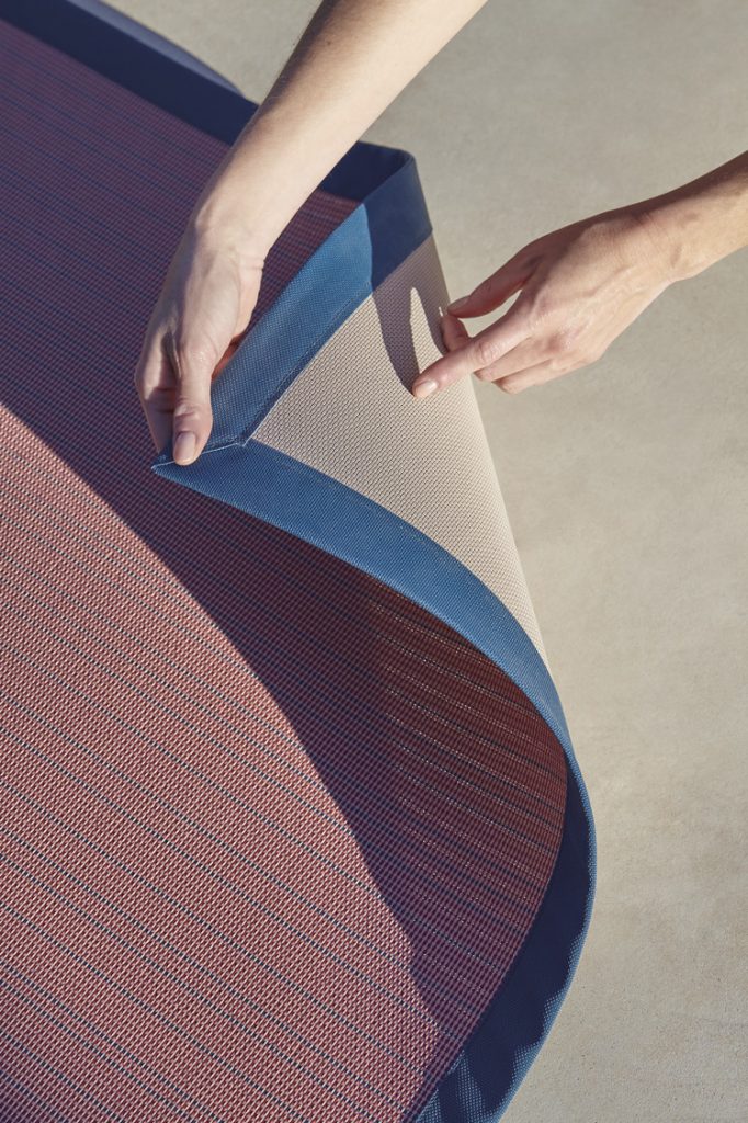
We took photographs playing with the volumes of the architecture to highlight the shapes of the carpets and accompanied them with details to appreciate the textures and the play of the threads.
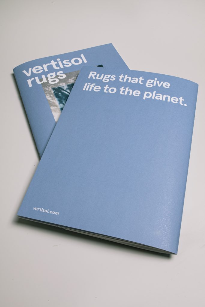
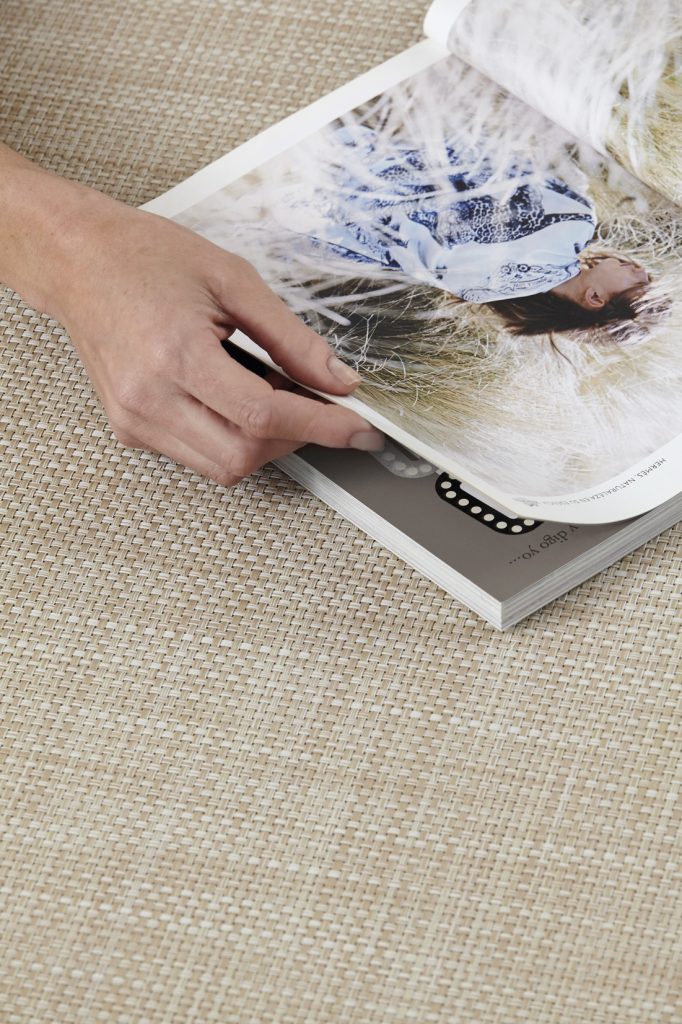
Editorial
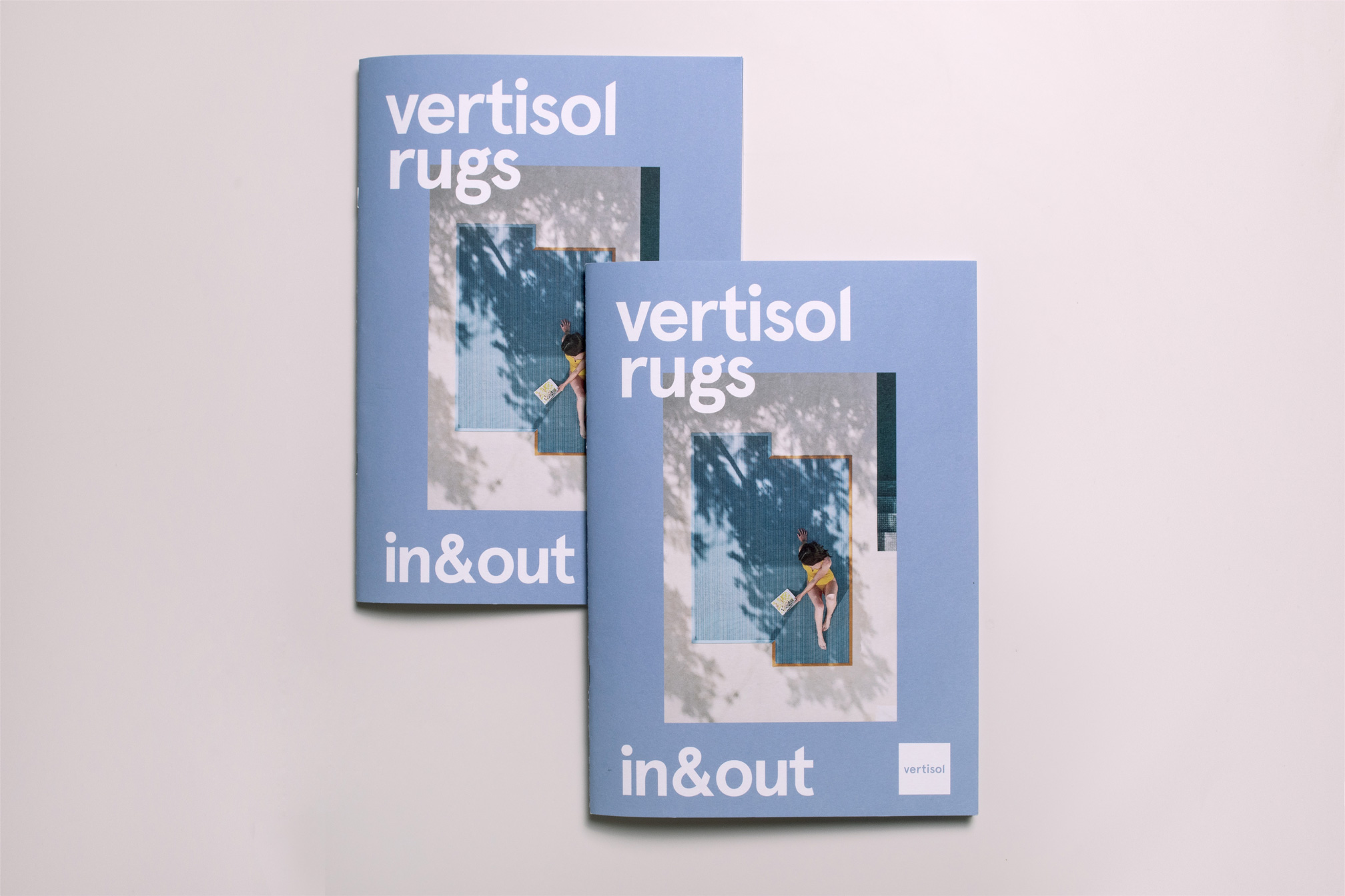
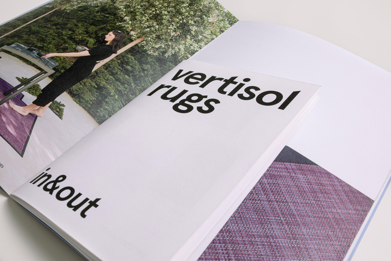
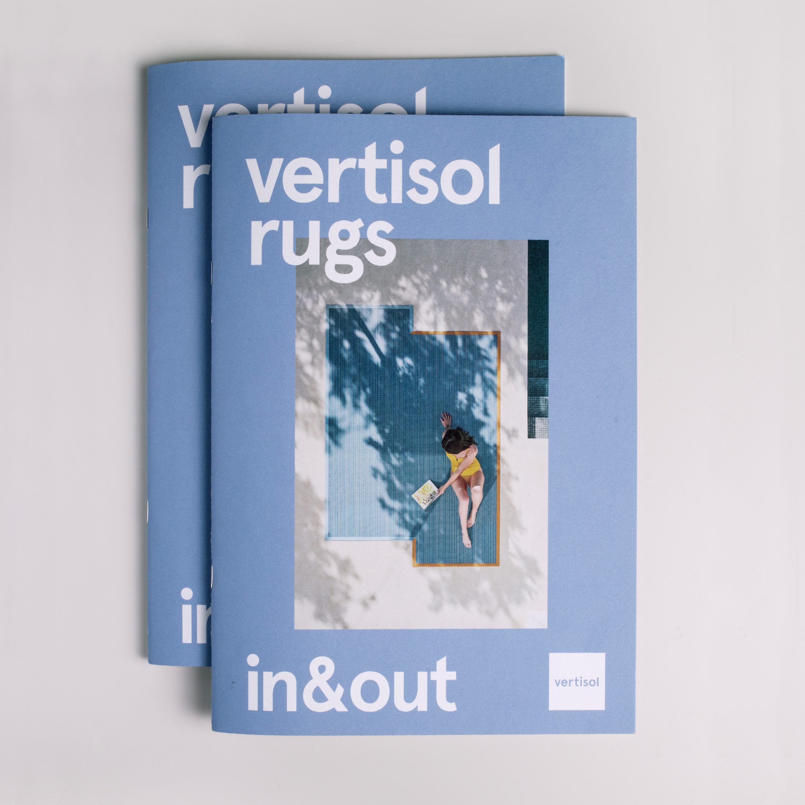
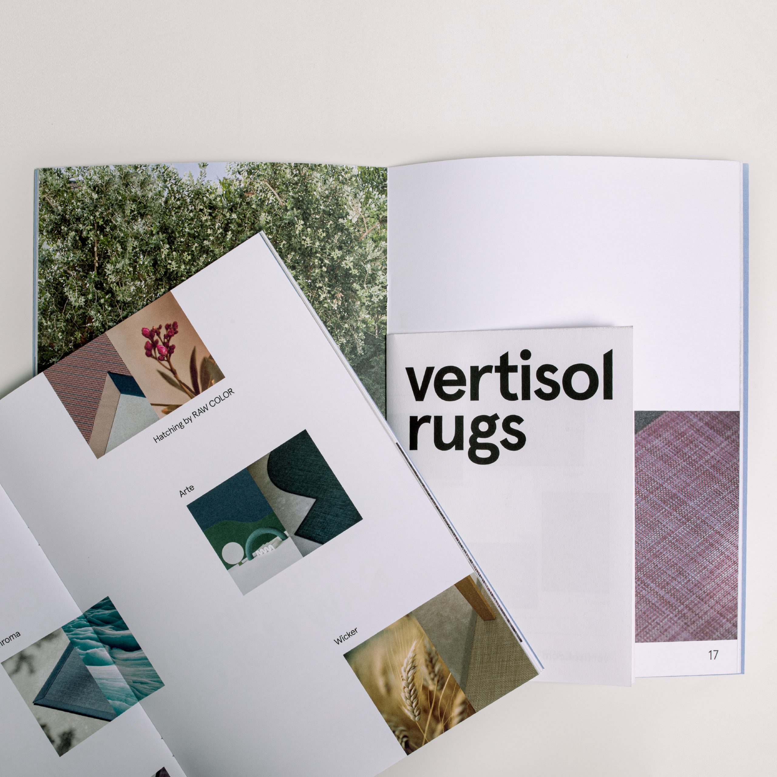
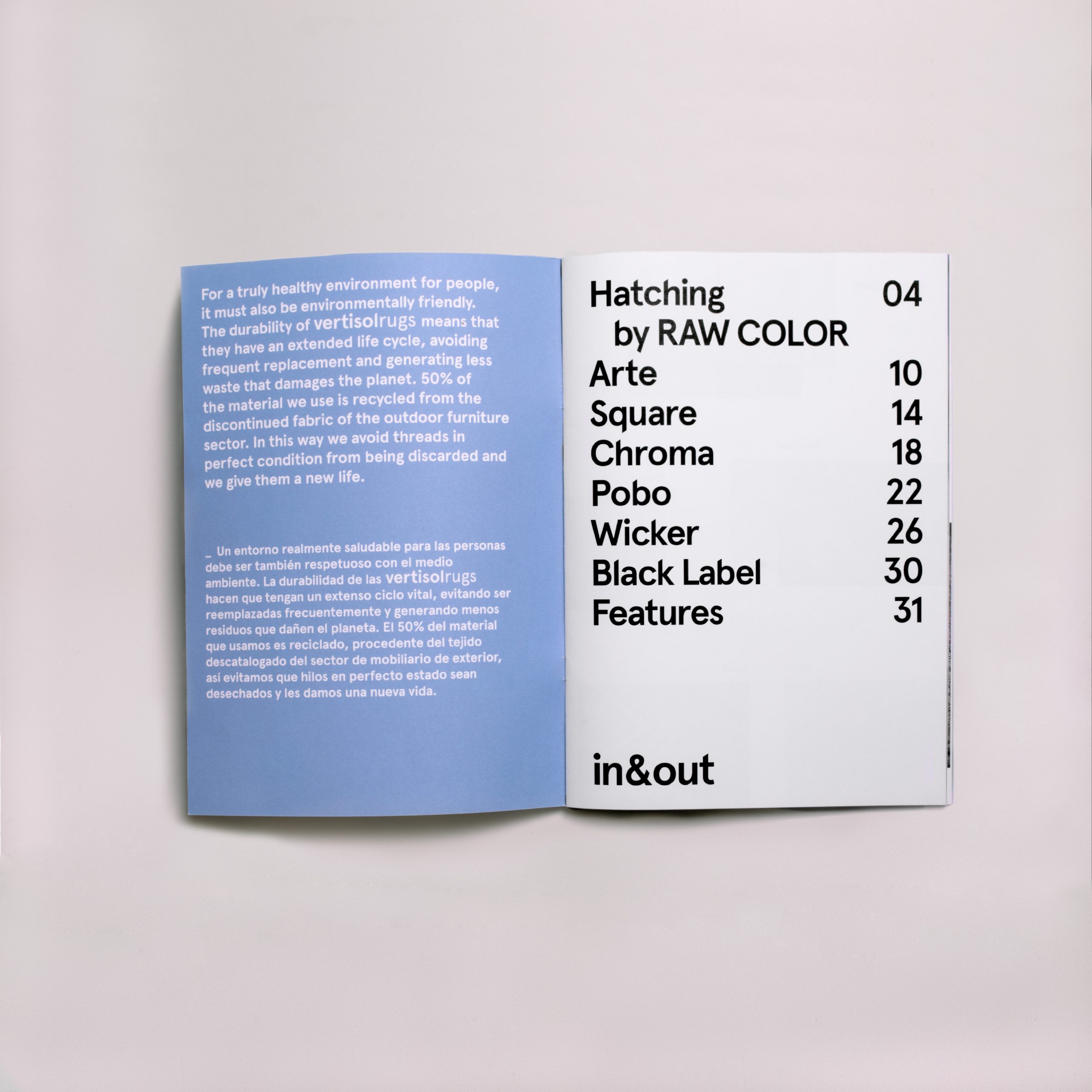
In the editorial part we aimed to design a simple but elegant, attractive and functional brochure, with a neutral style in line with Vertisol’s image. To show the seven VertisolRugs collections, we created inspiring images with the help of AI and then edited them to achieve harmonious compositions that help to understand the concept of each rug.
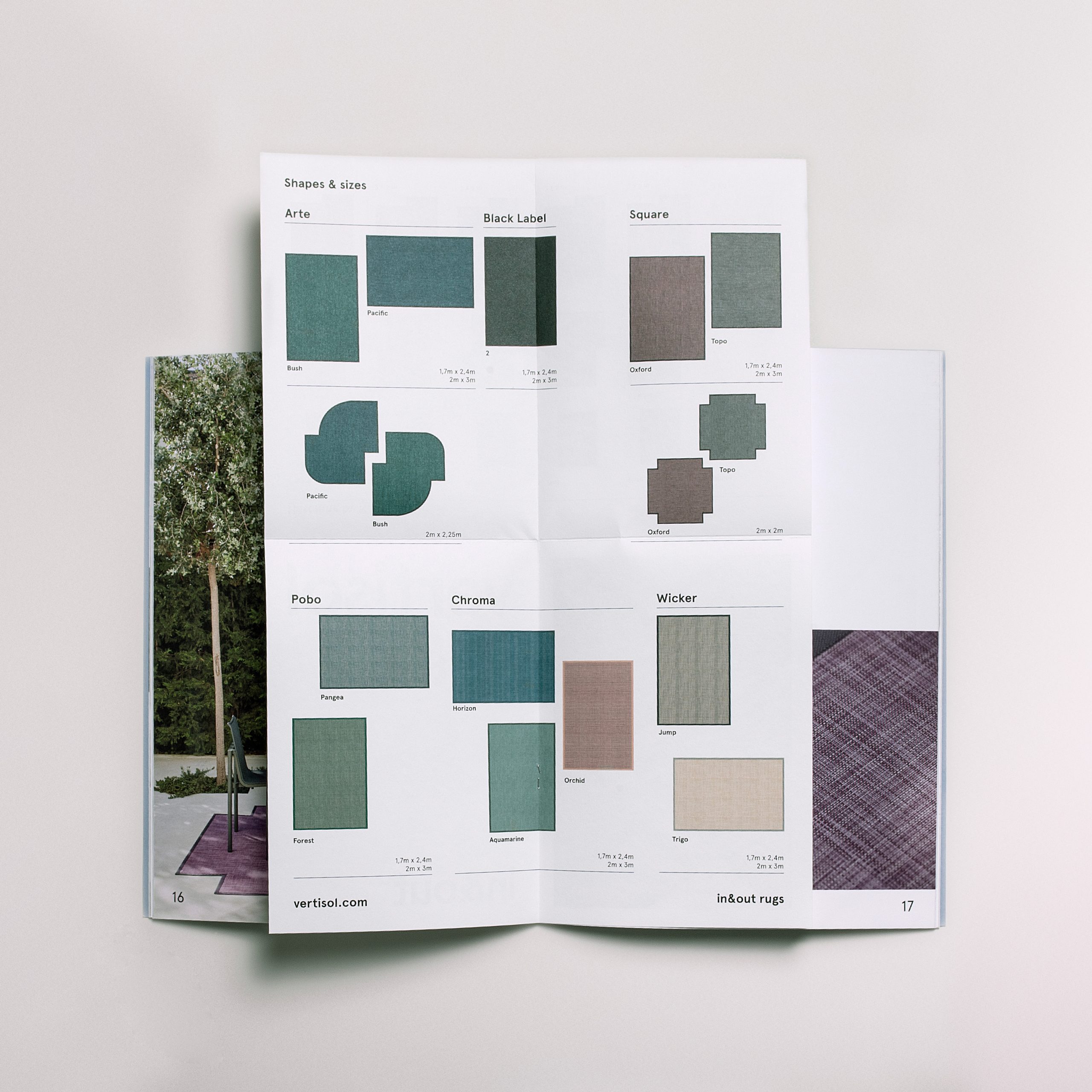
To showcase the collections, we created simple compositions prioritising the photographs so that the reader’s eye is drawn directly to the product. As a highlight, we designed a fold-out brochure with technical information that is incorporated into the inside of the publication in which we can see a summary of the entire collection. For this, we used a more porous paper to differentiate it easily from the rest of the catalogue in which we prioritised a paper that highlights the photographs.
This website uses cookies to improve your experience. We'll assume you're ok with this, but you can opt-out if you wish.AcceptRead More