Brief

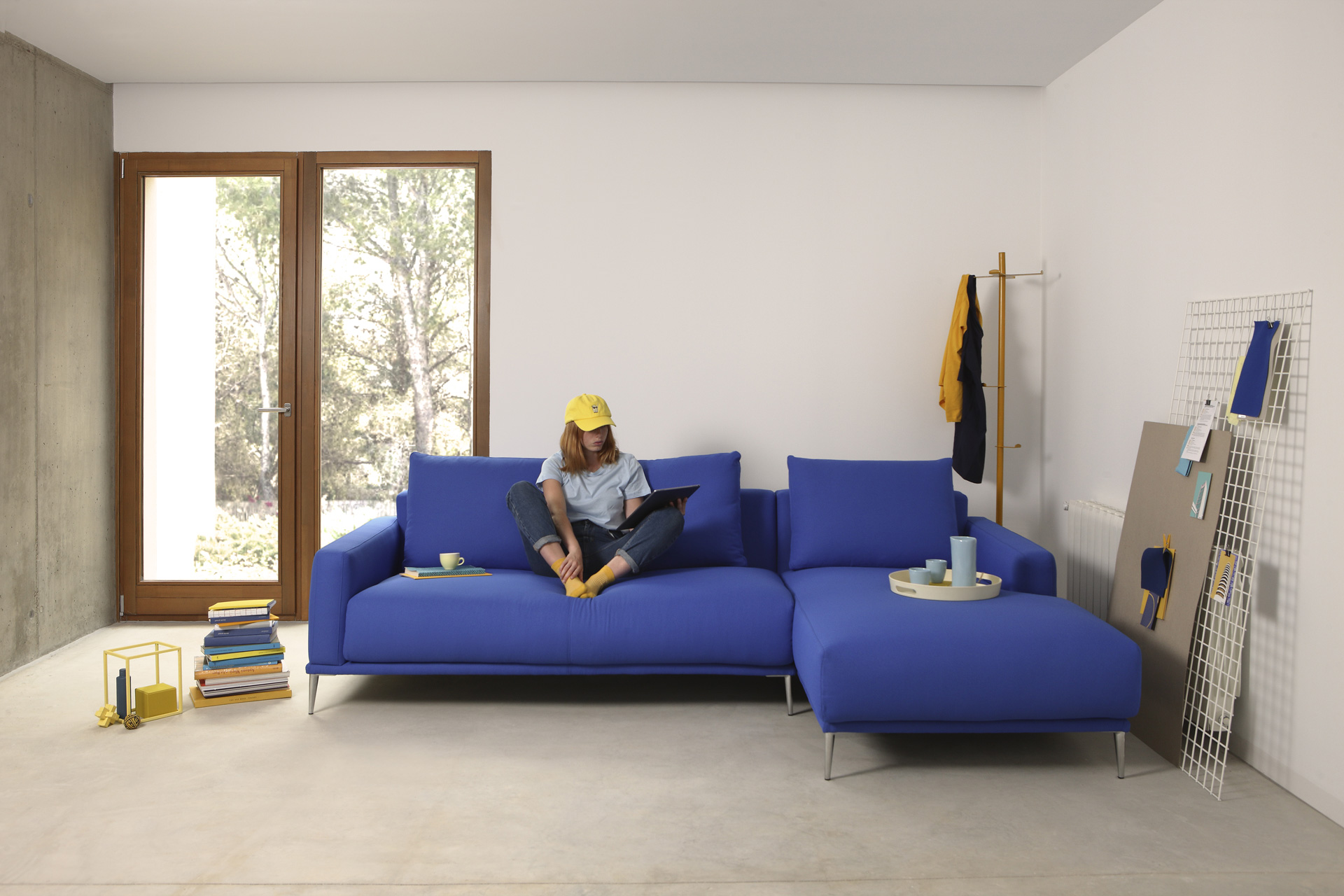
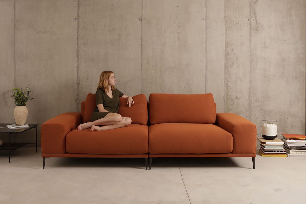
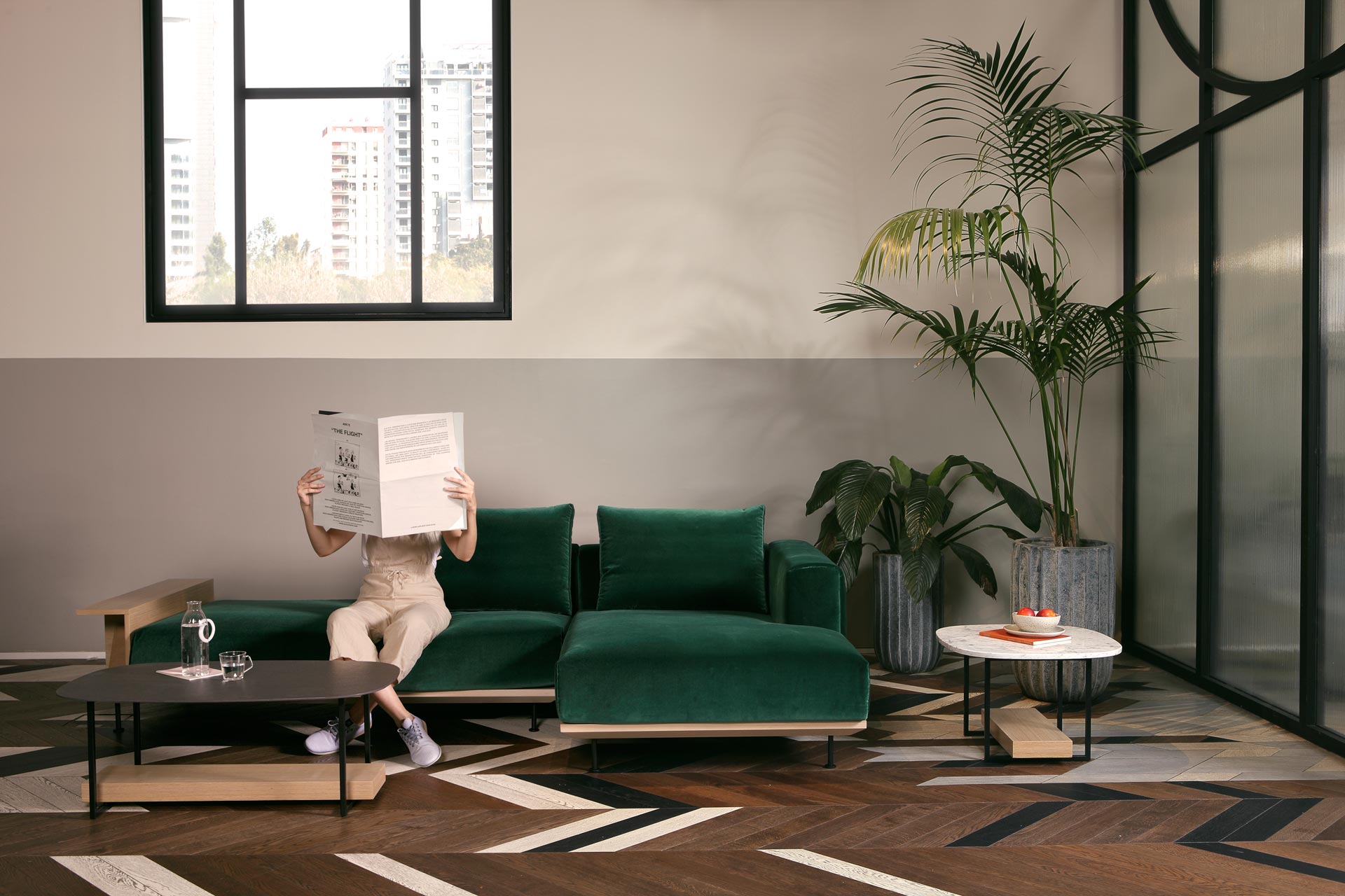
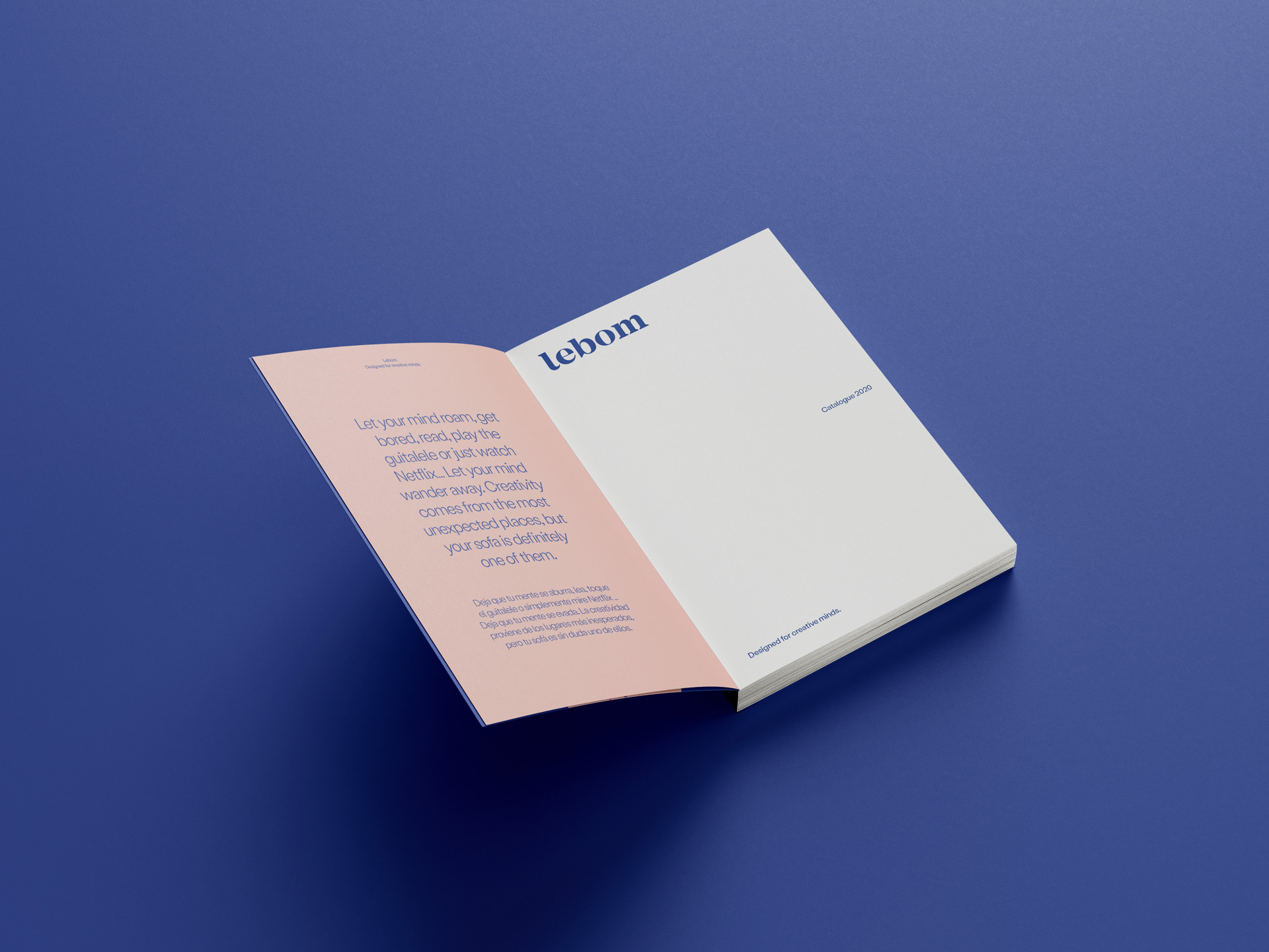
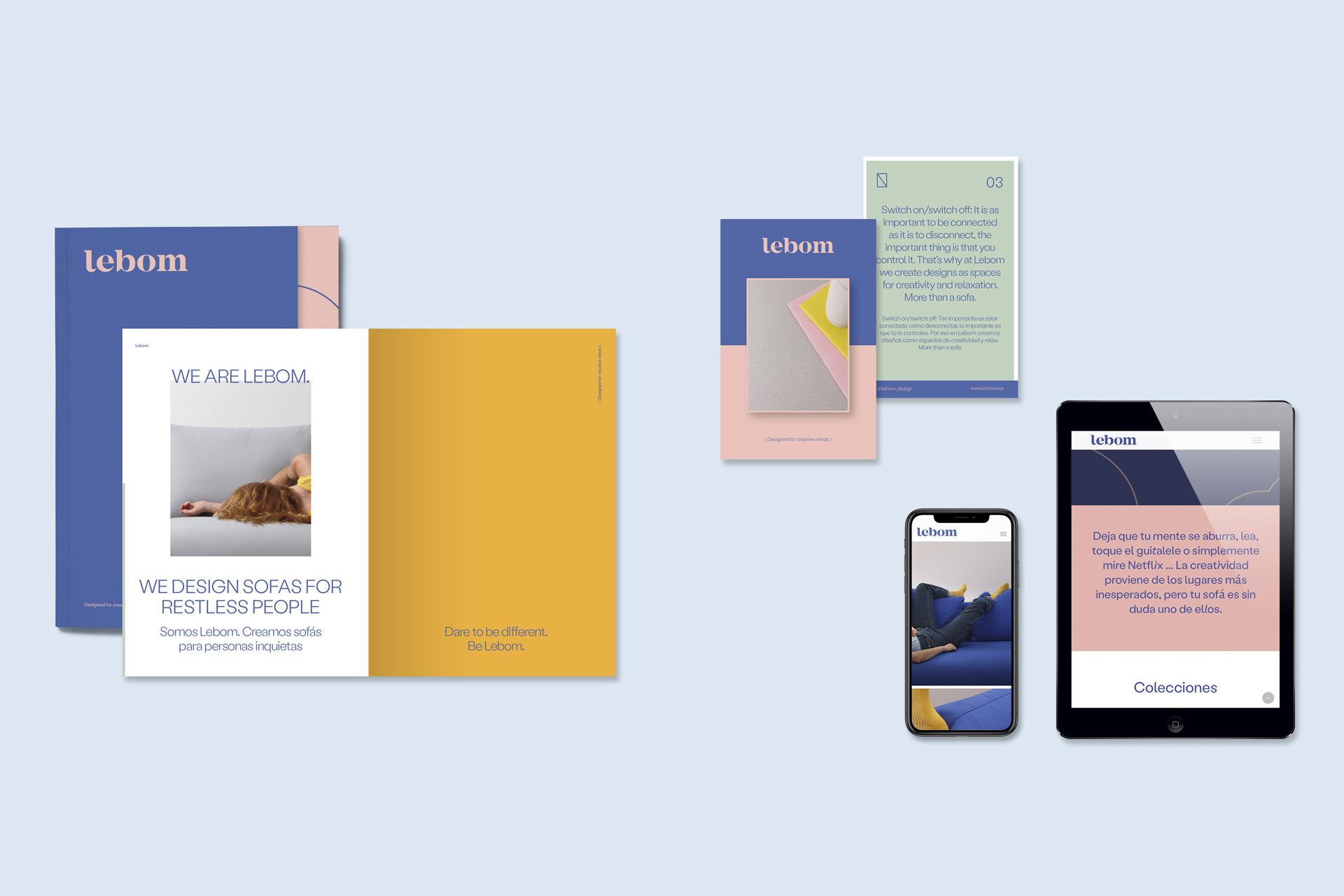
Lebom is a new sofa firm from Valencia that launches in a market context dominated by hundreds of names with more history and experience. The challenge was to make the brand not go unnoticed. But we had an advantage: a company with the necessary know-how, a unique vision of design and without fear of risk. In Odosdesign we assumed the creative and strategic direction of the brand, looking for a new language that would allow us to stand out and give it a unique personality.

Design & brand strategy

Born out of a desire to explore new territories for design, we have focused on its unique vision of creativity. Our goal was to create an energetic and vibrant brand, capable of capturing the spirit of its time and connecting with that creative vision of life: ‘Designed for creative minds’.

We want to avoid typical cliches of this sector. Lebom, more than a brand, is a way of understanding life, a creative vision of facing every situation. Therefore, we have defined a manifesto that serves as the brand’s code of conduct. “We believe that surrounding ourselves with creative people is essential to do things differently, and that is the way we understand design.”

Art direction

The Art Direction of photography has been the key to translate these conceptual ideas. We have connected Lebom with creative vision through casual style. The attitude of the models helps us to transmit this idea: “at Lebom we do not care what they think of us because we have clear ideas, we are not concerned about doing things differently because we believe in the creative power of design.”

Why does there have to be a correct way to use a sofa? Why are models always reading books? These type of ideas is what has nurtured the photographic direction. Scenes have been searched to understand the real context of the product. In addition to an intention in the posture and actions carried out by the models, every detail of the props has been taken care of to create a unique narrative. The color palette, a decoration of volumes and pure lines developed for the brand, accessories and selection of wardrobe and the selection of locations have been elements that have allowed us to transfer the conceptual idea to a visual plane.

Editorial design

Once the brand philosophy and design style were defined, the graphic and editorial design has allowed the generation of the different necessary tools. Personality traits have been translated through a style book with colors, fonts and a specific tone of voice.

The color palette responds to shades capable of connecting with the user of this product: he is young, cheeky and creative, but also close and comfortable, like Lebom. An aesthetic that configures a ‘new normality’ that connects with the spirit of our time. We have opted for a unique typography with a lot of movement, which runs away from classic resources and provides graphic intent to the texts.

As for the tone of voice, the intention is to get away from the boring speeches typical of furniture catalogs. That is why we have not developed a vision of the company, but a manifesto, as a statement of intent, where we establish the brand’s thinking in its way of facing design: surround yourself with creative people, dare to make mistakes, never give up on a beautiful design… are some of the relevant issues for the brand.

Digital

The website has been a direct translation of the lines set in the brand. A very visual tool that puts the focus on what’s important: creativity. The manifesto and the designers are a fundamental part of understanding the brand. Through a parallax, this idea of dynamism and lightness has been generated. Typographies and colors have done the rest of the work.

Social media has served to project Lebom’s unique tone of voice. We are not going to talk only about products, but we have to connect with the idea of creativity. The style in terms of copies is also sloppy and a little crazy.

Product

Understanding how the habitat sector changes is essential in a project of this type. Lebom must be a brand capable of moving easily in two territories: residential and contract. We have created a collection that fits within the design philosophy and that presents an opportunity to introduce the firm in public spaces.

Under the name Koh Tao, we have designed a collection of multipurpose poufs that allow you to work on many different projects. Koh Tao is inspired by this group of islands in Thailand, a country that reflects the free spirit of the brand. The collection works as a system of independent elements, like islands, that allow the space to be reconfigured in a simple way, elements that dialogue with each other, but which are free at the same time.

Spatial design

For the public presentation, the Feria Hábitat Valencia was chosen as a framework, one of the main events in the sector at a national level. An ad hoc produced prop was generated that would allow us to generate a differential brand language. The decoration stands out for a maximalist style, where the large volumes of color of the products take center stage.

The brand has complex designs that have the capacity to adapt to residential and public spaces. To do this, we created a Lebom hotel that would allow us to show that chameleonic capacity of each piece.

We used this event to present the brand to the press, but as always we did it in a different way. We invited journalists, designers and friends to eat a paella at the stand at an event called Paella & Design. A different way of generating a link with the press, through an informal event where we had good vibes.